


Dazzling Map Reveals Rising Menace of US Fires
A new map, done up in blazing color, plots more than a decade's worth of the massive fires that have hit the United States, offering a revealing portrait of an increasingly common menace.
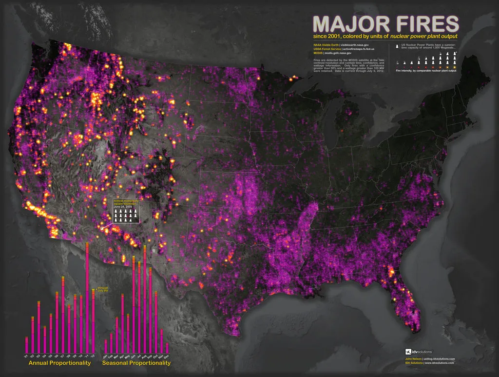
On a stark black background, complete with topographic features, the map shows not only where fires have burned between 2001 and July 2012, but also shows their intensity, veering from a wash of purplish dots for the smallest fires, up through stipples of red and smears of searing yellow for the mightiest blazes.
The data, provided by two NASA satellites, were "about two mouse clicks away," said John Nelson, the map's maker, and the user experience and mapping manager for IDV Solutions, a Lansing, Mich., data-visualization company.

Nelson, whose recent world earthquake map proved a fascinating undertaking, said the devastating images of Colorado Springs's recent destructive wildfires got him wondering about the history and reach of dangerous blazes, and he easily tracked down some relevant information on U.S. government agency websites.
Numbers as pictures
For the purposes of his map, Nelson plotted only fires of at least 100 megawatts (MW), and those for which NASA expressed at least a 50 percent confidence rating. "I wanted to capture the more meaningful fire events," he said.
Since it's hard to visualize what a megawatt actually means— "I was asking myself, 'What the deuce is a megawatt?'" Nelson said — he looked through Wikipedia for a device to express the measure in a more concrete way, and settled on the average summertime capacity of a nuclear power plant, or about 1,000 megawatts.
Get the world’s most fascinating discoveries delivered straight to your inbox.
A search through 2010 numbers from the U.S. Energy Information Administration suggests that number — about 1,000 megawatts — is a fairly accurate representation of average plant capacity over the course of a year.
Although some of the burns captured on the map could be so-called prescribed burns — controlled blazes that officials set to clear out flammable tinder from fire-prone areas —all but the tiniest fires are almost undoubtedly wildfires, and a time-scale version of the map shows the number of fires growing over the decade, a reflection of an alarming trend that fire researchers know all too well.
Fiery uptick
"Fire activity has definitely increased in terms of overall activity and acreage burned, and that's not just in the United States," said William Sommers, a research professor at George Mason University's EastFIRE Laboratory, and a former longtime director of fire research for the U.S. Forest Service.
Sommers said that prescribed burns aren't likely to have increased very much in recent decades because of strict regulation at the state level — pollution laws limit the number of burns allowed. In addition, he said, the preventative burns are not nearly as powerful as wildfires, and NASA instruments simply can't see them as well.
That means the overall increase is in wildfires, and that this can be attributed to three main factors: climate change, increasingly plentiful fuel for fires, and the increasing urbanization of wild places.
Sommers said that as people move into fire-prone regions, not only are there simply more people at risk and more houses to feed a monstrous fire if one should one ignite, but that it's also harder to conduct crucial fire prevention measures near a settled area. People don't want a prescribed burn in their backyard, he said, "but reducing fuel loadings would be the key to any kind of defense of a space."
The number of acres wildfires burn annually has doubled since 1960, according to a February 2012 report from the U.S. Forest Service, which points to climate change as a big factor in the increase. The report also says that fire seasons are likely to become longer and even more severe in the future.
"If you took housing out of the picture, just the fuels and the climate change would still, I believe, be causing a major increase in fire activity," Sommers said. However, he added, it’s the proximity to human populations that brings the emotional anguish and danger associated with fires, and pointed to the tragedies played out in block after block of incinerated homes in Colorado Springs this year.
"Most of your major, long-lasting fire events become news events when they affect people," he said.
Nelson said he's looking forward to hearing what people have to say about the map, which, he says, is simply a more aesthetically pleasing way of presenting data that are already out there.
"If something is appealing it will land in front of more eyeballs," he said. "And if you've got people looking at a pretty important topic, when maybe they wouldn't have been looking at it or thinking about it, then that's a good thing."
This article was provided by OurAmazingPlanet, a sister site to LiveScience. Reach Andrea Mustain at amustain@techmedianetwork.com, or follow her on Twitter @AndreaMustain. Follow OurAmazingPlanet on Twitter @OAPlanet. We're also on Facebook& Google+.