In Images: Top Winners of 'Information Is Beautiful' Awards
Earth Temperature Timeline
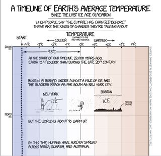
Garnering the gold in the Data Visualization category, Randall Munroe submitted this timeline of Earth's average temperature since the last ice age glaciation. [See the full timeline here.]
Seasonal Wind Predictions
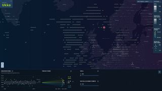
Stepping beyond weather forecasts and climate predictions, Project Ukko offers seasonal wind predictions for energy traders, wind farm managers and others, and takes the silver in the Data Visualization category of the Kantar Information is Beautiful Awards.
Read the article about the awards and the top winners.
The Missing Migrants Map
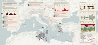
This visual representation records all the recorded incidents of migrants — deaths and those gone missing — along worldwide migration routes. The graphic secured gold in the Infographic category.
Swanh.Net
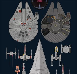
Earning silver in the Kantar Information is Beautiful Awards, Infographic category, this graphic is an adaptation of Star Wars Episode IV in one piece of 123 meters length.
Data Cuisine
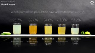
The Data Cuisine Workshop, not only garnered gold in the Dataviz Project category, but also the Outstanding Individual for the entire Kantar Information is Beautiful Awards. This project used edible diagrams to investigate the idea of representing data with food.
Roads to Rome
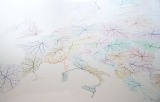
Exploring the ancient question: Do all roads really lead to Rome? this image stole the silver in the Dataviz Project category by displaying mobility patterns.
Sign up for the Live Science daily newsletter now
Get the world’s most fascinating discoveries delivered straight to your inbox.
Read the article about the awards and the top winners.
Spies in the Skies
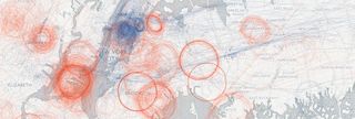
Securing gold in the Data Journalism category as well as Most Beautiful in the Kantar Information is Beautiful Awards, this map of government surveillance planes routinely circling major cities shows the extent to which America is being watched from above,
Science Isn't Broken
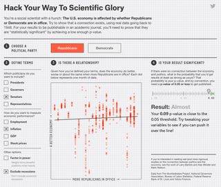
Snagging silver in the Data Journalism category, this entry offers an interactive graphic allowing users the opportunity to give "p-hacking" a try.
Shipmap.org
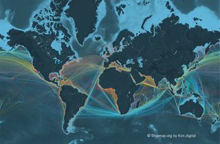
An ambitious interactive WebGL map of commercial shipping movements, Shipmap.org's mission is to highlight the massive scale of current commercial shipping — including the routes taken around the world, the geographic spread of the different types of boats and the carbon dioxide they produce. The submission secured gold in the Interactive category of the Kantar Information is Beautiful Awards.
What's your pay gap?
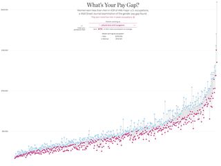
Taking silver in the Interactive category, this chart exhibits the gender pay gap for U.S. employees.
Read the article about the awards and the top winners.
Music Taste evolved
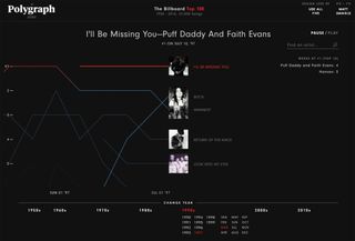
A graphic expressing how music taste evolved — including every top 5 song — between 1958-2016 also garnered the silver in the Interactive category of the Kantar Information is Beautiful Awards.

Mindy Weisberger is an editor at Scholastic and a former Live Science channel editor and senior writer. She has reported on general science, covering climate change, paleontology, biology, and space. Mindy studied film at Columbia University; prior to Live Science she produced, wrote and directed media for the American Museum of Natural History in New York City. Her videos about dinosaurs, astrophysics, biodiversity and evolution appear in museums and science centers worldwide, earning awards such as the CINE Golden Eagle and the Communicator Award of Excellence. Her writing has also appeared in Scientific American, The Washington Post and How It Works Magazine.
Most Popular

