In Images: Top Winners of 'Information Is Beautiful' Awards
Get the world’s most fascinating discoveries delivered straight to your inbox.
You are now subscribed
Your newsletter sign-up was successful
Want to add more newsletters?
Join the club
Get full access to premium articles, exclusive features and a growing list of member rewards.
Flowing Data
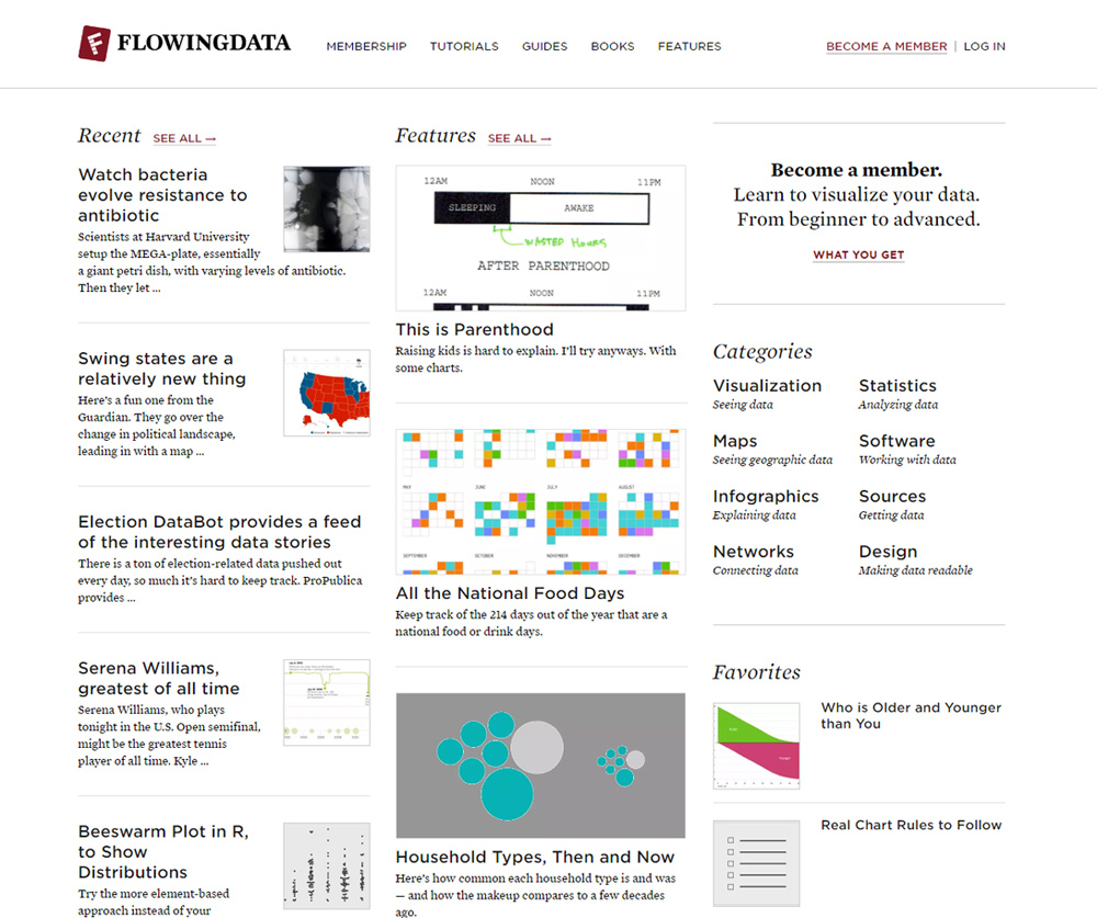
In the Dataviz website category of the Kantar Information is Beautiful Awards, FlowingData, capturing gold, helps everyone understand it from different points of view.
Visualising Data
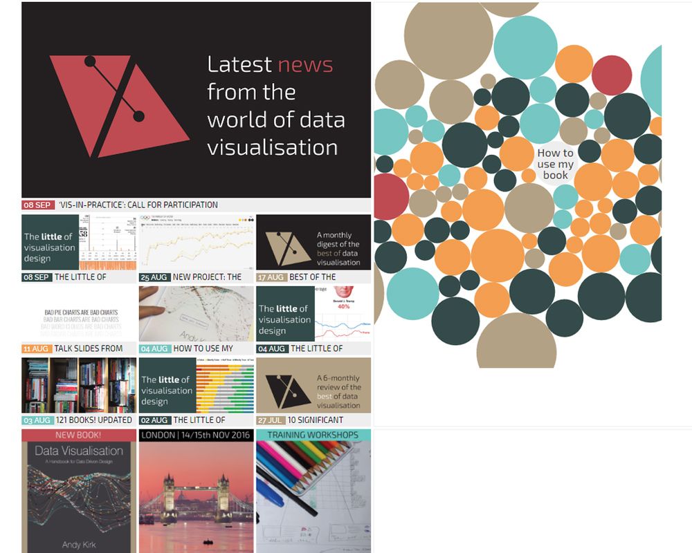
Winning silver in the Dataviz website category, VisualisingData.com provides a rich variety of content that chars the development of the visualization field while profiling professional services offered by Visualising Data Ltd.
Data USA
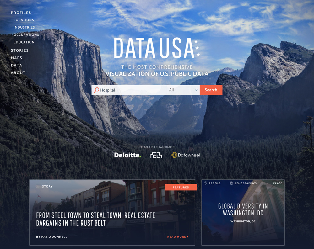
Bringing U.S. government data to the people, Data USA, a free and open source platform, combines data from many U.S. statistical agencies in close to 2 million visualizations. The site snagged gold in the the Commercial/Biz Project category of the Kantar Information is Beautiful Awards.
Article continues belowRead the article about the awards and the top winners.
IBM Watson News Explorer
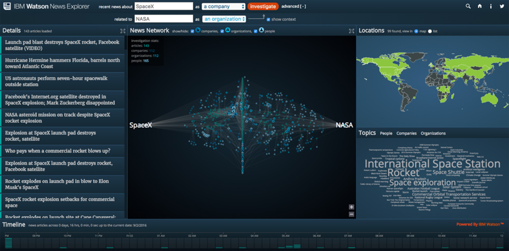
Using AlchemyData News API to construct a news information network presenting massive volumes of news results in an understandable fashion, the IBM Watson News Explorer captured silver Commercial/Biz Project category. Natural language revealing interconnected heterogenous details accompanied by linked visualizations encourage exploration and discovery on the site.
The sum of the parts
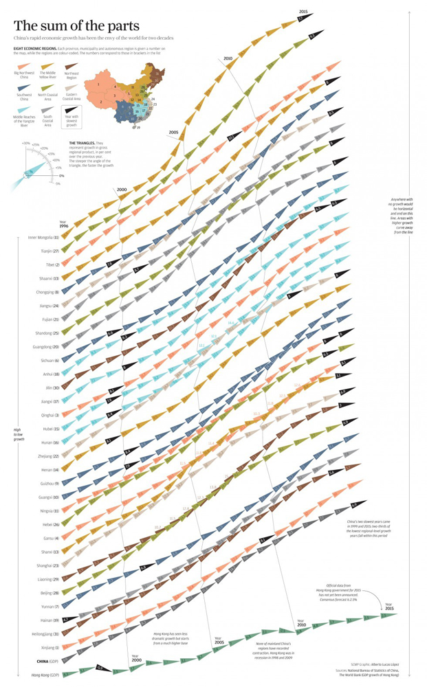
This chart expressing China's rapid economic growth garnered gold in the Community Awards category of the Kantar Information is Beautiful Awards.
WTFViz
Nonsensical infographics and dataviz from WTF Visualizations, snagging silver in the Community Awards category, draw a Twitter community into discussion of why.
Get the world’s most fascinating discoveries delivered straight to your inbox.
Read the article about the awards and the top winners.
The BMJ Infographics
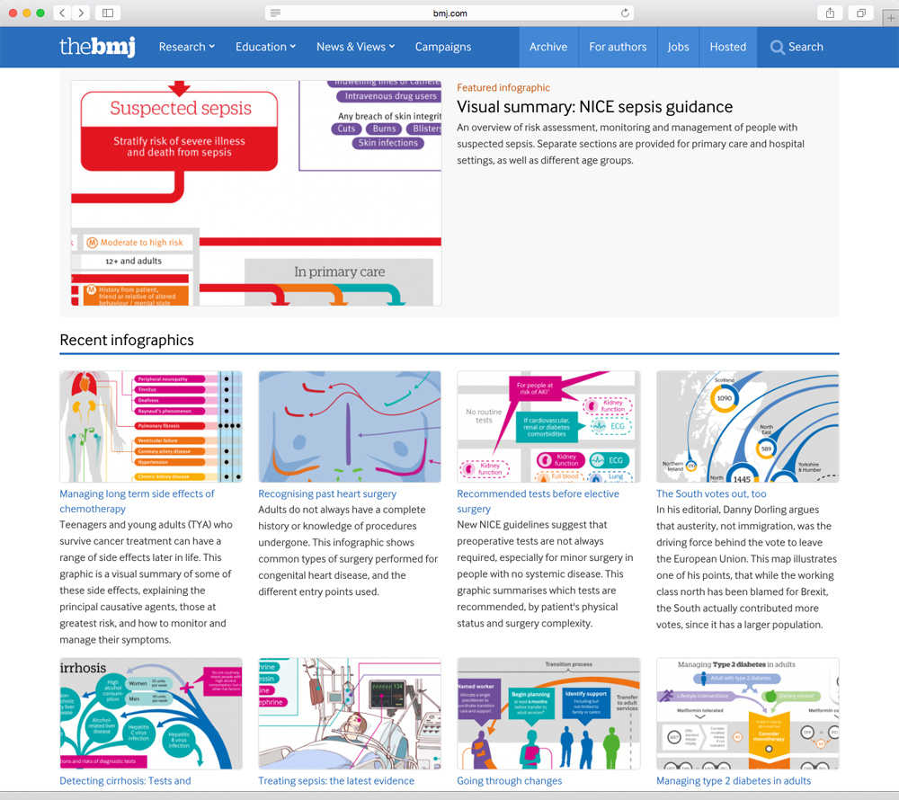
Coming from the basis that visual presentations can help consumers find needed information quickly and easily, Will Stahl-Timmins with BMJ Infographics was chosen as a Rising Star in the Kantar Information is Beautiful Awards.
Olympic Feathers
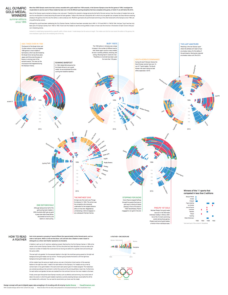
Also chosen as a Rising Star, Nadieh Bremer created this visualization of all Olympic gold medal winners since 1896 (5100 in all).
Income Inequality

Receiving a Student Award, Herwig Scherabon created two large prints to express income inequality in Los Angeles and Chicago.
Garbage sorting

An assignment for a class, Pei Lei Ye's garbage recycling chart earned a Student Award from the Kantar Information is Beautiful Awards.

Mindy Weisberger is a science journalist and author of "Rise of the Zombie Bugs: The Surprising Science of Parasitic Mind-Control" (Hopkins Press). She formerly edited for Scholastic and was a channel editor and senior writer for Live Science. She has reported on general science, covering climate change, paleontology, biology and space. Mindy studied film at Columbia University; prior to LS, she produced, wrote and directed media for the American Museum of Natural History in NYC. Her videos about dinosaurs, astrophysics, biodiversity and evolution appear in museums and science centers worldwide, earning awards such as the CINE Golden Eagle and the Communicator Award of Excellence. Her writing has also appeared in Scientific American, The Washington Post, How It Works Magazine and CNN.
 Live Science Plus


