
 Live Science Plus


35 optical illusions and why they trick your brain
Artists and scientists have been creating optical illusions for centuries. Here are 35 mind-bending examples that prove you can't always trust what your eyes are telling you.

Nicoletta Lanese

Optical illusions play tricks on your brain and can make you see things that aren't really there, from static images swirling around the page to images that stay with you even after you look away. Scientifically, researchers use optical illusions to gain insight into how humans see and process visual information, although the mechanisms behind many of them are still a mystery.
This list is based on the Merriam-Webster definition of optical illusion, which states that an optical illusion is "a misleading image presented to the vision." However, some researchers have argued that the term "optical illusion" should only be used for physical phenomena caused by light interacting with matter, and that illusions caused purely by the brain are technically "visual illusions."
Warning: Some of these images may cause dizziness. Caution is also advised for those with light sensitivity.

Lilac chaser, or Pac-Man illusion
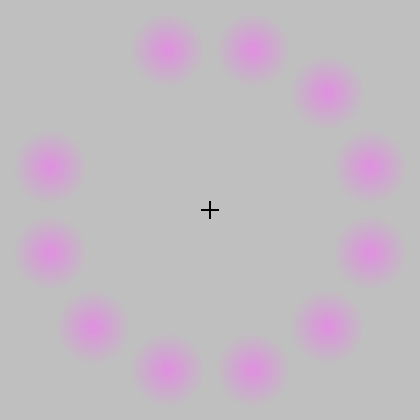
Jeremy Hinton is credited with creating this optical illusion. It includes a circle of pink dots arranged like a clockface against a gray background, as well as a small black cross in the middle. In rapid succession and in a clockwise pattern, each dot in the circle briefly disappears.
This illusion was created by Jeremy Hinton, who submitted it to an online archive of optical illusions in 2005. If you track the path of the disappearing dots with your gaze, the gap between the dots appears gray. But if you look instead at the plus sign in the center, the missing dot appears green.
The illusion involves the phi phenomenon, in which separate objects viewed in rapid succession appear to be moving along a continuous path. It also triggers negative retinal afterimages, which appear after the eye is exposed to one color in a fixed position for several seconds and then that color disappears or the eyes move away.
There are several theories for why this happens, but one is that the cells that send information from the retina to the brain adapt in that short window of time, adjusting for the excessive exposure to one color — magenta, in this case. When that color disappears, the adaptation makes the leftover space appear green, the complement of magenta. The idea is that this adaptation normally helps us interpret colors consistently under different lighting conditions by adjusting for the ambient color of our surroundings.
Cornsweet illusion

Viewed as is, the whole left half of this rectangle appears lighter than the right. But if you cover the center of the image with your hand, you can see that the rectangles are the same color, apart from the gradients at the center.
This illusion is thought to work due to top-down processing, in which the brain interprets objects in the context of their surroundings and our past experiences with similar stimuli.
The Cornsweet illusion, named after psychologist Tom Cornsweet, makes identical fields of color look different from one another by separating them by opposing gradients. When placed next to one another, these gradients make half of the image look brighter than the other half, when in reality, they're the same brightness. (You can see additional examples of the illusion in this archive of optical illusions curated by scientist Michael Bach and this 2002 American Scientist article.)
Get the world’s most fascinating discoveries delivered straight to your inbox.
This illusion is thought to work due to top-down processing, in which the brain interprets objects in the context of their surroundings and our past experiences with similar stimuli. When it sees these two opposing gradients next to each other, the brain makes a quick inference about the lighting source for each half of the rectangle. Based on the patterns it has encountered previously, the brain interprets half of the rectangle as brightly lit and the other as dimly lit. This can also create illusions of depth on flat surfaces — a technique used in art.
"The dress"
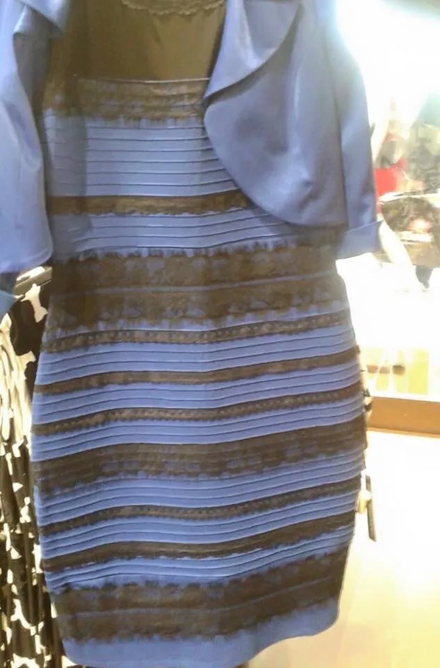
"The dress" went viral in 2015, breaking the brains of internet users everywhere.
White and gold, or blue and black? This internet-famous optical illusion has been attributed to color constancy, a phenomenon in which the brain makes inferences and adjustments to consistently see objects as the same color under different lighting conditions. People whose brains interpreted the dress as being photographed in daylight or in shadow saw the garment as white and gold. People whose brains interpreted it as being lit by artificial light saw a blue-and-black dress, studies have suggested.
Because the original dress photo was overexposed, it made the lighting source unclear and forced viewers' brains to fill in both the likely lighting source and the true colors of the garment, scientists posit. (For the record, the dress is, in fact, blue and black.)
Scintillating Starburst

The Scintillating Starburst illusion appears to have bright rays emanating from its center.
The Scintillating Starburst illusion tricks us into seeing bright rays of light. The illusion is made up of concentric polygons that form a series of wreath-like patterns. If the illusion works, you'll see bright rays shining through the intersection points between the outer peaks of each wreath. Our brain perceives bright dots at these intersection points, because they're the thinnest parts of the wreath, and it then invents rays to connect those dots.
Researchers unveiled the Scintillating Starburst in a 2021 study published in the journal i-Perception. Study co-author Michael Karlovich, a visual artist with a background in neuroscience, created the illusion in 2019 while designing the logo for his company, Recursia.
My wife and my mother-in-law
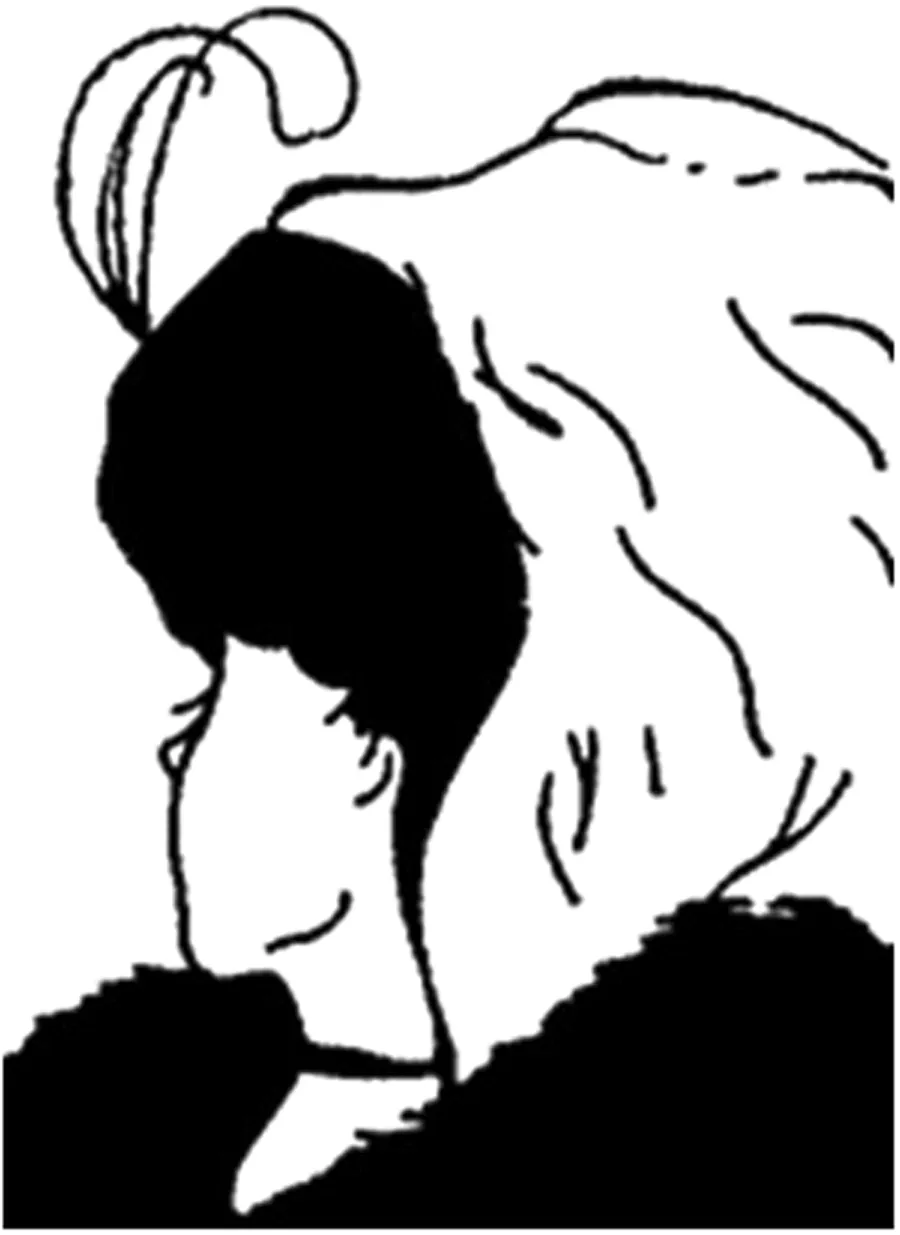
"My Wife and My Mother-in-Law" is an optical illusion depicting a young woman and an old woman in the same image.
Do you see a younger woman or an older woman? This ambiguous image depicts a young woman looking over her right shoulder and an older woman looking either straight ahead or down — there are a few different versions. The design first appeared on a German postcard in 1888 and was later adapted by cartoonist William Ely Hill in a piece he titled "My Wife and My Mother-in-Law."
A 2018 study published in the journal Scientific Reports found that which woman you perceive is linked to your age, suggesting younger people tend to see the younger woman and older people tend to see the older woman. However, a 2021 study, also published in the journal Scientific Reports, found no relationship between age and perception; instead, they found people use their own age as a "yardstick" to assess the age of the figure regardless of which one they see.
Hermann grid

Dark spots appear in the Hermann grid illusion that don't really exist.
Look at the Hermann grid illusion and your brain will probably create dark blobs that aren't really there at the intersections of the white grid lines. Physiologist Ludimar Hermann first documented the illusion in 1870, according to Oxford Reference.
Researchers are still deciphering the exact mechanisms behind how the Hermann grid works, but it could be linked to the response of retinal ganglion cells, which receive and transmit information coming into the eye. Ganglion cells are excited by light, and the intersections of the grid appear dark because there is less net excitatory stimulation at these points than along the lines, according to the Ross lab at the University of Pittsburgh.
Confetti Spheres 5

This illusion is known as the Confetti Spheres 5.
Confetti Spheres 5 is an illusionary image that dupes the human brain into seeing different colored spheres that are, in fact, all the same shade of beige. Our vision perceives shapes in greater detail than colors, and in this case, the colors of the stripes bleed over into our perception of the spheres. Specifically, it's the stripes cutting across the sphere that mess with our perception of the color behind them. Look closely, and you'll see that the foreground stripes in each orb correspond with the shade of the orb behind. We see the orbs in their true color of beige when the foreground stripes are removed or pushed to the background.
Curvature blindness
The curvature blindness illusion, created by Kohske Takahashi.
The curvature blindness illusion demonstrates how humans can perceive a wavy line as an angular zigzag. In the image above, all of the lines are the same wavy shape, but half of them appear to be zigzagging in the gray section. Kohske Takahashi, a psychology professor at Chukyo University in Japan, documented this illusion in a 2017 study published in the journal i-Perception. Takahashi suggested that the brain has a separate mechanism for identifying curved and angular shapes, and that the perception of angles may take priority when they compete in the curvature blindness illusion.
Duck or rabbit?
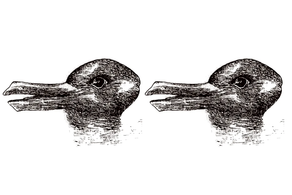
This ambiguous image by artist Joseph Jastrow depicts both a duck and a rabbit.
Do you see ducks or rabbits? The ambiguous image above features both. The animals share the same features, but depending on which one you perceive, you'll see a duck bill or rabbit ears on the left of each design. Our brains interpret information from just a few clues, so we don't see both animals at the same time. Even when there are two of these images side by side, humans often need additional context to see one of each animal.
Hering illusion

The Hering illusion is a type of geometrical-optical illusion.
Our brains may also be trying to visually predict the future when we see an image like this.
The Hering illusion features two straight, vertical lines that appear to bend. This is a type of geometrical-optical illusion. German physiologist Ewald Hering first reported the illusion in 1861, according to Oxford Reference. Hering's explanation for why the two parallel lines appear to bend outwards was that our brains overestimate the angle made at the points of intersection between the red lines and the radiating blue lines.
Our brains may also be trying to visually predict the future when we see an image like this, because there's a lag between when light hits the retina and when our brain perceives that light. In this case, the lines converge on a vanishing point at the center of the spokes, which makes our brains think we're moving forward, and so they try to predict what's going to happen next.
Rotating snakes

An example of the rotating snakes illusion based on the original concept by Akiyoshi Kitaoka.
The rotating snakes illusion is a motion illusion in which we perceive movement that isn't happening. Everything in the image above is static, and yet the overlapping round objects appear to swirl. If you stare at any specific point in the image, the effect stops. A 2005 study published in the Journal of Vision suggested that most people's visual systems infer the presence of motion in static, repeated asymmetric patterns like this one, because the design invokes a pattern of neural activity that normally occurs when an object is moving.
Checker shadow

The two labeled squares are the same shade of gray in the checker shadow illusion.
Both labeled squares in the Checker shadow illusion are the same shade of gray, but the illusion tricks our brains into seeing them as different shades. Edward Adelson, a professor of vision science at the Massachusetts Institute of Technology (MIT), created this illusion. The square labeled "A" appears much darker because it is surrounded by lighter squares, while the square labeled "B" appears lighter, because it is surrounded by darker squares. The illusion of a shadow also adds to this effect.
The visual system's job is to break the information in an image down into meaningful components to perceive the nature of the objects we see. While it generally does that job very well, it's not especially good at being a physical light meter, according to MIT's Perceptual Science Group website.
Scintillating grid

The scintillating grid illusion triggers the brain to see dark spots that don't exist.
The scintillating grid illusion causes the brain to perceive dark spots inside the white circles present at the intersection of grid lines. These spots can flash in and out of our peripheral vision so rapidly — especially with eye movement — that some people might find it difficult to look at the illusion for too long. The illusion is a modification of the Hermann grid illusion, which also causes dark dots to appear at the intersection of lighter lines, though the scintillating grid illusion is even more eye-catching. If you try to look directly at one of the perceived dark spots, then it will disappear.
Rubin's vase

An illustration of Rubin's vase.
Do you see two faces or a vase? Rubin's vase, or Rubin's face, depicts both, because the side profile of two identical faces matches the outline of a vase — sometimes a candlestick. Illusions like Rubin's vase are called ambiguous images because, well, they're ambiguous.
Researchers are still debating how Rubin’s vase works. The debate includes whether our visual experience of the figure changes when we see a switch between the faces and vase, or whether the experience doesn't change, and it's instead a belief, judgment or other mental process that changes after the experience, according to The Illusions Index, an online database of illusions supported by the University of Glasgow in Scotland.
Rubber Pencil

The rubber pencil illusion will make a rigid pencil transform into rubber, like magic.
The rubber pencil illusion is a classroom classic. Pick up a pencil and shake it with your thumb and forefinger. If you get the angle and motion just right, then the rigid pencil will appear to transform into rubber before your eyes. The pencil remains rigid, of course, but your brain can't keep up with the movement.
The human brain processes the information our eyes see, but each signal we receive from the rods and cones in our eyes is like a photograph. The brain links those images together so they appear smooth, but it's not perfect. Humans can only process 50 to 1,000 individual frames each second, so we only get a summary of what's happening.
Impossible cube

An impossible cube is a popular geometric design that couldn't physically exist.
There are different versions of the impossible cube, but they're all geometric shapes that we wouldn't be able to physically create. These cubes give the illusion of being a real shape, but there's always at least one line running both in front of and behind another line to reach a corner — something you can design in two dimensions but can't build in three dimensions. Dutch graphic artist Maurits Cornelis Escher created the first impossible cube as part of his Belvedere artwork, which features other impossible figures, according to The Illusions Index.
Peripheral drift

An anomalous motion image that creates the illusion of movement.
Peripheral drift illusions are a type of anomalous motion illusion that gives the illusion that static images are moving like a video. Take a look at the image above, and you'll likely see the dots swirl on the page like they're floating on water. However, if you focus on any specific dot, then the effect of perceived motion should stop. This illusion depends on eye movement, with the dots swirling in the periphery.
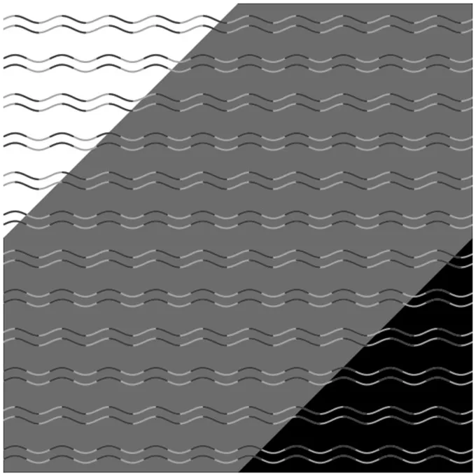
Café wall

The café wall illusion features straight, horizontal lines that appear to bend.
The café wall illusion features a checkered "wall" with horizontal lines that appear to bend in different directions. In reality, though, the horizontal lines are actually straight and run parallel to one another. Researchers aren't yet certain why this illusion works so well, but it appears to be linked to interactions between the neurons that code for orientation in the visual cortex, according to The Illusions Index.
The café wall illusion name came from researchers at the University of Bristol in the U.K., who documented the effect on the side of a cafe wall in the 1970s. It is a form of the Münsterberg illusion, named after psychologist Hugo Münsterberg, who first documented the illusion at the end of the 19th century, according to Oxford Reference.
Kanizsa square

An example of the Kanizsa Square.
Look at the Kanizsa square above, and you'll probably see a large white square in the middle of the image. The square isn't really there, but your brain perceives its presence by filling in the gaps between the four Pac-Man-like shapes. Another version of this illusion, called the Kanizsa triangle, has the same effect. The square and triangle are named after Italian psychologist Gaetano Kanizsa, who discovered them in the 20th century, according to Oxford Reference.
Troxler effect

An example of the Troxler effect.
Details in a person's peripheral vision start to fade when they focus on an unchanging stimulus for a prolonged period.
The Troxler effect, or Troxler fading, is a disappearing optical illusion in which images start to vanish when you look at them. Try staring at the center of the image above for 20 seconds. If the effect works, you should see the surrounding colors in your periphery begin to fade to white.
Swiss physician and polymath Ignaz Paul Vital Troxler discovered the Troxler effect at the beginning of the 19th century. Troxler hypothesized that details in a person's peripheral vision start to fade when they focus on an unchanging stimulus for a prolonged period. This could be because our brains are so good at adapting to new stimuli that they begin to ignore nonessential information.
Birds of paradise

A male bird of paradise displaying super-black plumage.
The plumage of some male birds of paradise is so dark that it creates a kind of "black hole" optical illusion. Their feathers are too dark for us to see in detail, so the birds can appear as a single, dark blob. A 2018 study published in the journal Nature Communications found that the feathers of these super-black birds have a different shape on a microscopic level from normal black feathers, and are particularly prone to scattering and reabsorbing light. Super-black birds of paradise belong to the family Paradisaeidae and live in Indonesia, Papua New Guinea and Australia.
Afterimage

A U.S. flag with inverted colors can become an afterimage illusion.
Afterimages stay in your vision after you stop looking at them. Try staring at the example above for 30 seconds and then looking at a white background. If the illusions work for you, then you'll briefly see the U.S. flag in its normal colors. This is an example of a negative afterimage, which inverts colors.
The afterimage illusion works because the color receptors in the retinas of our eyes get tired and stop working properly if we stare at a color for too long. When that happens, the information received from the color receptors isn't balanced, and you see different colors, according to the University of Washington. However, our eyes quickly recover, so your vision should return to normal after a few seconds.
Hybrid image

An example of a hybrid image illusion featuring Albert Einstein and Marilyn Monroe.
What you see in a hybrid image illusion changes depending on how far away you are from the image. The example above combines a photo of Marilyn Monroe with an image of Albert Einstein. Most people will see Albert Einstein in the top image if they're up close and Marilyn Monroe if they view the image from a distance. You'll get the same effect if you increase and decrease the size of the image.
The example above is derived from the work of Aude Oliva, a cognitive and computer scientist at MIT, and her colleagues, who created many different hybrid images featuring Albert Einstein. Each design consists of a high-resolution image and a low-resolution image stacked on top of one another. Up close, our brains focus on the details of the high-resolution image, while from a distance, we see the broad outlines of the low-resolution image.
Forced perspective

A woman appearing to touch the roof of a lighthouse is an example of forced perspective.
In this example of forced perspective, a woman appears to touch the roof of a lighthouse, as if the woman is a giant or the lighthouse is very small. In reality, the woman is just much closer to the camera, and the lighthouse is in the distance behind. Forced perspective tricks our brains into perceiving objects to be much closer or farther away than they are, as well as smaller or larger than their actual size.
Gray Bar

The horizontal bar in this illusion is all the same color.
The horizontal bar in this image is the same shade of gray all the way across, but the background makes our eyes perceive it as lighter on the left and darker on the right. This is an example of a simultaneous contrast illusion that deceives our brains into seeing different colors, where in reality, there is only one. The brightness or color in the background of the image alters our perspective of the color in the foreground.
A 2023 study published in the journal PLOS Computational Biology used a computer model to mimic how human brains decipher information from images like the gray bar example. Their results suggested that brains don't need complex visual processing or past experiences for the illusion to work.
Ehrenstein illusion

An example of the Ehrenstein illusion.
Do you see white circles in the image above? The circles aren't there, but your brain fills in the gaps where the lines are about to intersect and perceives bright circles. The physiological mechanisms behind why the human brain fills in blind spots like this are unclear, according to The Illusions Index. This is an example of the Ehrenstein illusion. German psychologist Walter Ehrenstein introduced this type of illusion in the 20th century, hence the name.
Blue dot effect
Are the dots blue or purple? Your experience with colors can alter how you perceive them.
A 2018 study published in the journal Science found that people's perceptions of colors can change based on their experiences. The researchers presented college students with a series of blue and purple dots. At first, the number of blue and purple dots was equal, and participants correctly identified the two colors. However, as the team reduced the number of blue dots to the point that they became rare, participants continued to perceive blue dots, incorrectly saying some purple dots were blue. Participants in the study had started broadening their definition of a color based on their previous experience in a process called "prevalence-induced concept change."
Expanding hole

Illusorily expanding holes trick your brain into perceiving motion.
The "expanding hole" image is a type of illusionary expanding hole that gives the impression that the dark part of the image is expanding. In reality, the image is static, and the movement is an illusion. Researchers have suggested that the effect occurs because the image tricks our brains into thinking we are moving into a darkened space, so we perceive a change in brightness that doesn't exist. Essentially, what happens is that the natural reaction in the brain that predicts light change is hijacked by the illusion — it doesn't work for everyone.
Asahi illusion of brightness

The Asahi illusion of brightness by Akiyoshi Kitaoka.
Look at the Asahi illusion of brightness above, and you'll probably think that the white at the center looks brighter than the white surrounding the image. However, the white is actually the same right across the image.
Brightness illusions like this one have a geometric resemblance to the gradients shaped by sunlight glare obscured by cloud formations or plant leaves, according to a 2022 study published in the journal Frontiers in Human Neuroscience. The Asahi illusion of brightness is one of many illusions created by Akiyoshi Kitaoka, a professor of psychology at Ritsumeikan University in Japan.
Müller-Lyer illusion

An example of the Müller-Lyer illusion.
Which line is longer? In this example of the Müller-Lyer illusion, the top line looks longer than the bottom line, and yet they are the exact same length. The presence of the arrowheads and arrow tails at the ends of the lines changes the way we perceive length. The arrowheads make the line look smaller, and the arrow tails make the lines look longer. Researchers are still debating how this simple visual illusion tricks our brains, but it might stem from how our visual systems process information. The illusion is named after German psychologist and sociologist Franz Carl Müller-Lyer, who discovered it in 1889, according to Oxford Reference.
Cube colors

The yellow tiles on the left cube and the navy tiles on the right cube are the same shade of gray in this illusion.
The tiles that appear yellow on top of the left cube are actually the same shade of gray as the tiles that appear blue on top of the right cube — you might have to zoom in or crop the image to see the gray. This is an example of a simultaneous contrast illusion, and demonstrates how a change in background light can make our brains perceive the same color in different ways. Brains don't need complex visual processing or past experiences for the illusion to work, according to a 2023 study published in the journal PLOS Computational Biology.
Neon-color-spreading illusion

An example of a neon-color-spreading illusion.
The illusion may work because input from V2 warps our perception, filling in the shape because that's what the brain "expects" to see, despite the lines being disconnected.
Neon-color-spreading illusions are patterns featuring some lines that are a different color from the rest, which our brains perceive as a solid shape. Look at the image above, and you'll likely see a bright, lime-green circle within the patterns. It's not entirely clear why our brains fill in the gaps to create the outline of a shape in illusions like this one.
A 2024 study published in the journal Nature Communications found the illusion worked on mice and that so-called V1 neurons play a key role in the process, with feedback from V2 neurons. V1 processes very basic features of an image while V2 processes more complex details and pulls in data from our memories. The illusion may work because input from V2 warps our perception, filling in the shape because that's what the brain "expects" to see, despite the lines being disconnected.
"Star Wars" scroll illusion

The "Star Wars" scroll illusion shows how two parallel scrolls of text can appear to fork.
Look at the "Star Wars" scroll illusion, and you'll see two scrolls of text — similar to the scroll at the beginning of "Star Wars" movies. The scrolls in this illusion appear to move away from each other at different angles, but they are actually exact copies of one another with the same dimensions. Arthur Shapiro, a psychology professor at American University in Washington, D.C., first described this effect in a 2015 study published in the journal i-Perception.
There's a conflict between what Shapiro calls the "picture plane," where invisible boundary lines define the boundaries of the text, and the perspective interpretation — how we see the image. In this case, we see that the scrolling texts are moving toward vanishing points at the top of the screen that don't appear to be parallel.
White's illusion

The gray bars are the same shade in this example of White's illusion.
The gray bars in the image above will probably appear darker on the left and lighter on the right, but they are actually the same shade of gray. This is an example of White's illusion, which refers to the perceived changes in the lightness of gray bars that have assimilated to the color of uninterrupted bars on either side of them. The bars bookended by black appear darker than those surrounded by white.
Psychologist Michael White at The University of Adelaide in Australia identified and developed White's illusion from a design created by an 11th-grade student named Susan Hirth, after seeing it in the book "Optical Art: Theory and Practice" (Beekman House, 1969).
Wundt illusion

The Wundt illusion.
A pair of straight vertical lines appear to bend towards each other in the Wundt illusion. This geometric optical illusion is an inverted design of the Hering illusion, in which blue spokes radiate out from the center of the image, giving the illusion that the bars are bending away from each other.
One possible explanation for the Wundt illusion is that our perceptual systems tend to expand acute angles, making them appear larger than they are and creating the impression that the red lines are bending inward, according to The Illusions Index. The Wundt illusion is named after German psychologist Wilhelm Wundt, who first published the design in 1896, according to Oxford Reference.
Editor's note: This article was updated with additional entries on May 20, 2025.

Patrick Pester is the trending news writer at Live Science. His work has appeared on other science websites, such as BBC Science Focus and Scientific American. Patrick retrained as a journalist after spending his early career working in zoos and wildlife conservation. He was awarded the Master's Excellence Scholarship to study at Cardiff University where he completed a master's degree in international journalism. He also has a second master's degree in biodiversity, evolution and conservation in action from Middlesex University London. When he isn't writing news, Patrick investigates the sale of human remains.
- Nicoletta LaneseChannel Editor, Health
You must confirm your public display name before commenting
Please logout and then login again, you will then be prompted to enter your display name.