

-
 U.S. Premature Births Report Card (Infographic)
The U.S. only rates a "C" grade in reaching the goal of reducing premature births to 9.6 percent.
-
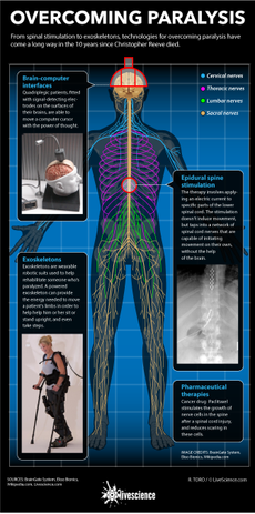 Overcoming Paralysis (Infographic)
From spinal stimulation to exoskeletons, technologies for overcoming paralysis have come a long way in the 10 years since Christopher Reeve died.
-
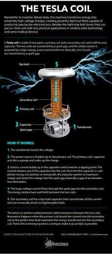 How the Tesla Coil Works (Infographic)
How Tesla coils generate high-voltage electrical fields.
-
 Desertion Rates in the U.S. Army Since 1970 (Infographic)
Desertion has never been higher since 1971, when more than 33,000 soldiers deserted.
-
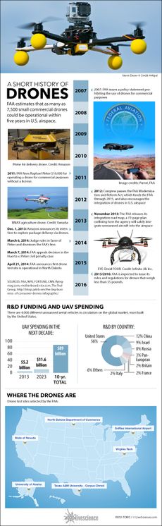 Facts About Drones (Infographic)
Unmanned aerial vehicles have been increasingly popular in recent years.
-
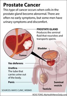 Facts About Prostate Cancer (Infographic)
The prostate in relation to the male anatomy.
-
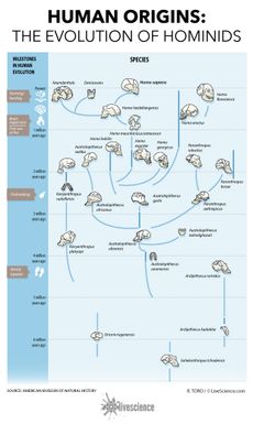 Human Origins: How Hominids Evolved (Infographic)
Humans are just the latest in a long line of hominid species that have emerged in the past six million years.
-
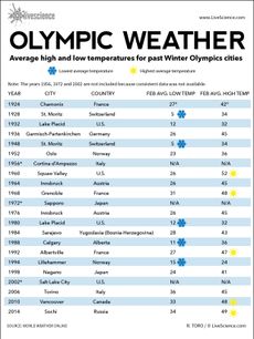 Olympics: Warmest and Coolest Years on Record (Infographic)
Chart shows average high and low temperatures of Olympics sites since 1924.
-
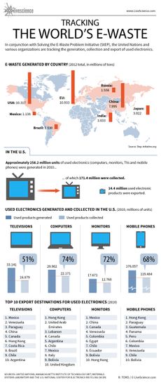 Tracking the World's E-Waste (Infographic)
The U.S. and China produce more total e-waste than any other country, according to a new map that tracks e-waste around the world.
-
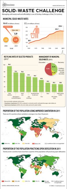 Managing the World's Waste (Infographic)
The challenge of managing the world's waste in the 21st century.
-
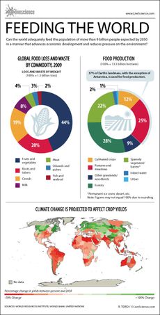 Can the World Feed 11 Billion People? (Infographic)
Climate change threatens to reduce crop yields in much of the world.
-
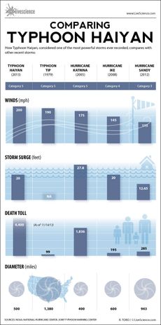 Major Hurricanes and Typhoons Compared (Infographic)
Typhoon Haiyan dwarfed recent big storms, but wasn't the largest one recorded.
-
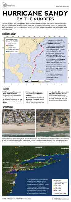 Hurricane Sandy's Impact (Infographic)
A by-the-numbers look at the devastation caused by Hurricane Sandy.
-
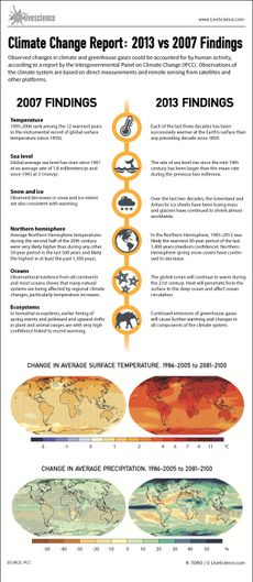 Global Warming Evidence: 2007 Report Compared to 2013 (Infographic)
The IPCC's 2013 report presents the strongest case yet that humans are responsible for the changes in the Earth's environment.
-
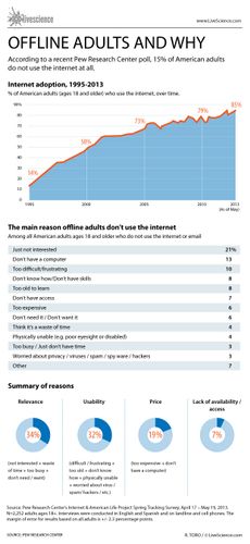 Who Isn't Using the Internet? (Infographic)
A recent poll shows that 15 percent of Americans don't use the Internet at all.
-
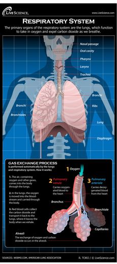 Diagram of the Human Respiratory System (Infographic)
Find out all about your lungs and how breathing works.
-
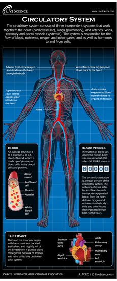 Diagram of the Human Circulatory System (Infographic)
Find out all about the blood, lungs and blood vessels that make up the circulatory system.
-
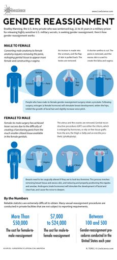 How Gender Reassignment Surgery Works (Infographic)
All about sex change surgeries.
-
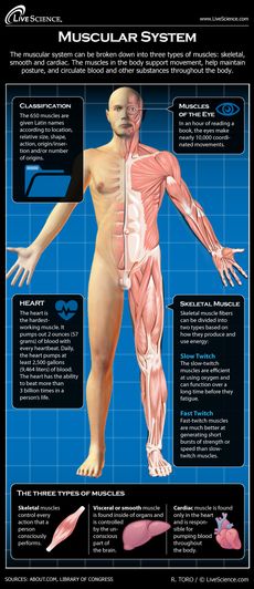 Diagram of the Human Muscular System (Infographic)
Learn about the muscles that move your body and keep you alive.
-
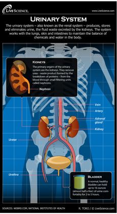 Diagram of the Human Urinary System (Infographic)
How the human body's urinary system works.
-
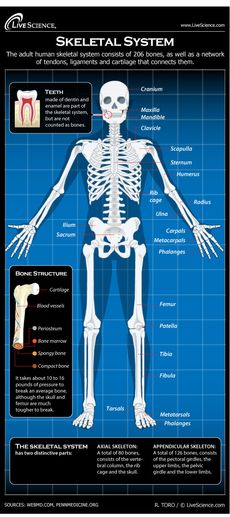 Diagram of the Human Skeletal System (Infographic)
All about your body's skeleton, the framework of bones that keeps you together.
-
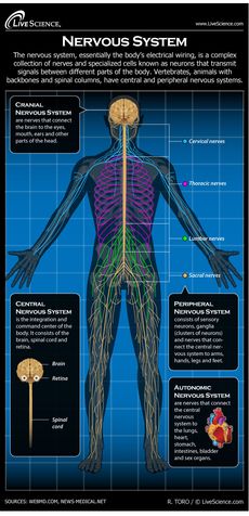 Diagram of the Human Nervous System (Infographic)
Find out about the workings of the brain and nerves.
-
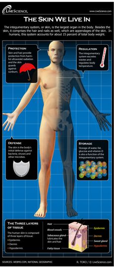 Diagram of the Human Integumentary System (Infographic)
The skin is the largest organ of the body, and helps protect it from the environment.
-
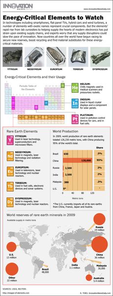 Facts About Rare Earth Elements (Infographic)
Rare earths play a crucial role in the manufacture of modern electronics gear.


