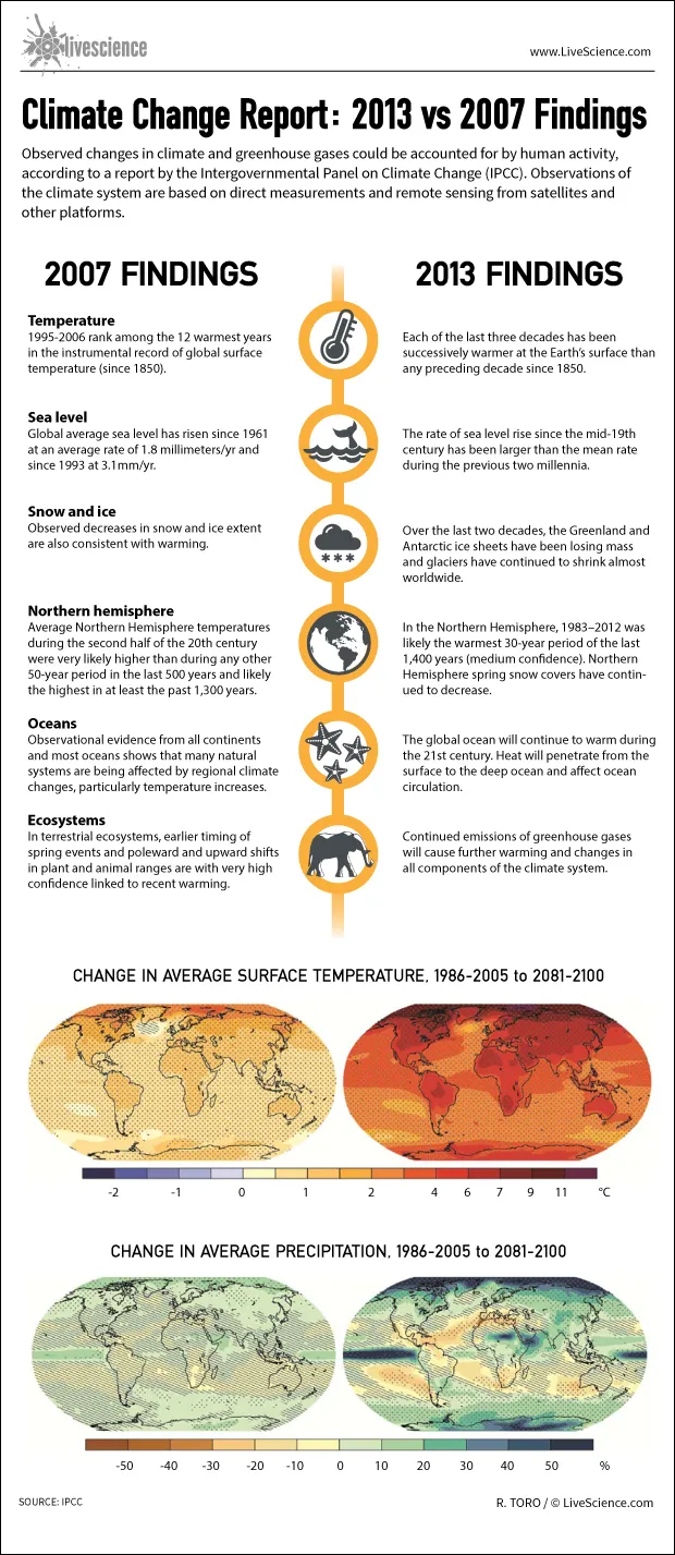
Observed changes in climate and greenhouse gases could be accounted for by human activity, according to a report by the Intergovernmental Panel on Climate Change (IPCC). Observations of the climate system are based on direct measurements and remote sensing from satellites and other platforms.
IPCC's 2007 report compared with 2013's:
TEMPERATURE
Latest Videos From
2007: 1995-2006 rank among the 12 warmest years in the instrumental record of global surface temperature (since 1850).
2013: Each of the last three decades has been successively warmer at the Earth’s surface than any preceding decade since 1850.
SEA LEVEL
2007: Global average sea level has risen since 1961 at an average rate of 1.8 millimeters/yr and since 1993 at 3.1mm/yr.
2013: The rate of sea level rise since the mid-19th century has been larger than the mean rate during the previous two millennia.
SNOW AND ICE
2007: Observed decreases in snow and ice extent are also consistent with warming.
2013: Over the last two decades, the Greenland and Antarctic ice sheets have been losing mass and glaciers have continued to shrink almost worldwide.
NORTHERN HEMISPHERE
2007: Average Northern Hemisphere temperatures during the second half of the 20th century were very likely higher than during any other 50-year period in the last 500 years and likely the highest in at least the past 1,300 years.
2013: In the Northern Hemisphere, 1983–2012 was likely the warmest 30-year period of the last 1,400 years (medium confidence). Northern Hemisphere spring snow covers have continued to decrease.
OCEANS
2007: Observational evidence from all continents and most oceans shows that many natural systems are being affected by regional climate changes, particularly temperature increases.
2013: The global ocean will continue to warm during the 21st century. Heat will penetrate from the surface to the deep ocean and affect ocean circulation.
ECOSYSTEMS
2007: In terrestrial ecosystems, earlier timing of spring events and poleward and upward shifts in plant and animal ranges are with very high confidence linked to recent warming.
2013: Continued emissions of greenhouse gases will cause further warming and changes in all components of the climate system.

 Live Science Plus