


Stunning Map Reveals World's Earthquakes Since 1898
If you've ever wondered where — and why — earthquakes happen the most, look no further than a new map, which plots more than a century's worth of nearly every recorded earthquake strong enough to at least rattle the bookshelves.
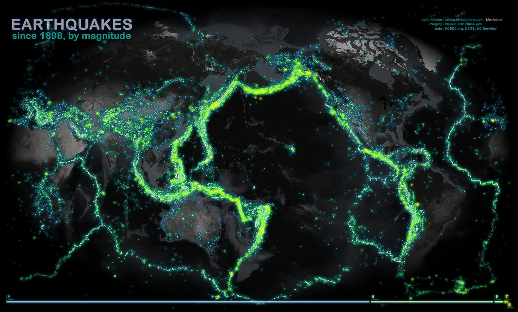
The map shows earthquakes of magnitude 4.0 or greater since 1898; each is marked in a lightning-bug hue that glows brighter with increasing magnitude.
The overall effect is both beautiful and arresting, revealing the silhouettes of Earth's tectonic boundaries in stark, luminous swarms of color.

The map's maker, John Nelson, the user experience and mapping manager for IDV Solutions, a data visualization company, said the project offered several surprises.
"First, I was surprised by the sheer amount of earthquakes that have been recorded," Nelson told OurAmazingPlanet. "It's almost like you could walk from Seattle to Wellington [New Zealand] if these things were floating in the ocean, and I wouldn't have expected that."
In all, 203,186 earthquakes are marked on the map, which is current through 2003. And it reveals the story of plate tectonics itself.
Earthquake makers
Get the world’s most fascinating discoveries delivered straight to your inbox.
The long volcanic seams where Earth's crust is born appear as faint, snaking lines cutting through the world's oceans. The earthquakes along these so-called spreading centers tend to be rather mild. The best studied spreading center, called the Mid-Atlantic Ridge, bisects the Atlantic Ocean, on the right side of the image.
Its Pacific counterpart wanders along the eastern edge of the Pacific Ocean, cutting a wide swath offshore of South America. Another spreading center makes a jog though the Indian Ocean and up through the Red Sea.
But one glance at the map shows that the real earthquake action is elsewhere. [7 Ways the Earth Changes in the Blink of an Eye]
Subduction zones, the places where tectonic plates overlap and one is forced to dive deep beneath the other and into the Earth's crushing interior — a process that generates the biggest earthquakes on the planet — stand out like a Vegas light show.
Nelson said this concept hit home particularly for the Ring of Fire, the vast line of subduction zones around the northern and western edge of the Pacific Ocean.
"I have a general sense of where it is, and a notion of plate tectonics, but when I first pulled the data in and started painting it in geographically, it was magnificent," Nelson said. "I was awestruck at how rigid those bands of earthquake activity really are."
That realization prompted one big decision about the map's design, Nelson said. Unlike many maps made in the United States, this one is centered over the Pacific Ocean. "That looked like where the magic was happening," Nelson said. California, a spot rattled by quakes where faults jolt horizontally, also shines brightly.
Teaching tool
There are undoubtedly many earthquakes missing, given the dramatic change in scope and accuracy of seismological instruments from 1898 to the present day. Nelson said he saw a huge jump in the volume of data from the 1960s forward. Yet even without the complete catalog of earthquakes, the map provides a striking visual reference — even though none of the data are new.
All the earthquake information and maps are freely available on the Internet courtesy of the U.S. Geological Survey, university and state partners in California, and NASA.
"There's nothing new about plotting earthquakes," Nelson said. "It's just presenting it in an interesting way."
And although he was modest about his own role as a designer, Nelson emphasized the value of design in making data more engaging. The project was a follow-up to a recent map of more than 50 years of tornado tracks across the United States; he said both maps are designed to get people more interested in the larger phenomena behind them. "To get them to start asking questions," Nelson said.
In short, a colorful map will grab people more than an Excel spreadsheet, even when both contain the same information.
"It seems almost superficial, but it's true," Nelson said. "If something is treated with thoughtful design, then it becomes better."
Reach Andrea Mustain at amustain@techmedianetwork.com, or follow her on Twitter @AndreaMustain. Follow OurAmazingPlanet on Twitter @OAPlanet. We're also on Facebook& Google+.