It's quick and easy to access Live Science Plus, simply enter your email below. We'll send you a confirmation and sign you up for our daily newsletter, keeping you up to date with the latest science news.
Tornadoes and Waffle House, the venerable greasy spoon breakfast establishment that is a staple of Southeast highway stops, may not seem to have much to do with one another (except for their occurrence in the Southeast). But a map showing the highest concentrations of the restaurant by latitude, which has been making the rounds on Twitter, inspired one meteorologist to look at tornadoes in the same way.
“My mind works in interesting ways. I came across this graphic of Waffle Houses by latitude and it got me thinking about how I could use a similar map related to weather,” Tim Brice, who created the maps, told Climate Central. “The first thing that came to mind was to show the latitude (and the longitude) of tornado touchdowns.”
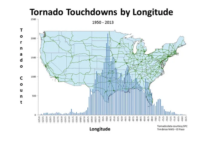
And that’s just what he did. Using data available from the National Weather Service’s Storm Prediction Center, Brice, a meteorologist with the NWS office in El Paso, Texas, sorted verified tornadoes by their latitude and longitude and came up with two bar graphs showing each, laid out over the proper coordinates on a U.S. map.
The resulting graphics show pretty clearly where tornadoes are most common in the U.S. In the longitude map, a clear spike corresponds to the so-called Tornado Alley, stretching across the Plains states from the Dakotas down to Texas, with a second, smaller spike corresponding to Dixie Alley, covering much of the Southeast That incidentally corresponds with the biggest spike in Waffle House restaurants, proving the classic science proverb that correlation doesn’t always equal causation.
A third spike aligns with Florida and is likely due to a summertime spike in waterspouts and funnel clouds spun up by the strengthened sea breeze, said Harold Brooks, a tornado researcher and forecaster with the National Severe Storms Laboratory. The tornadoes that form in this manner in Florida aren’t fueled by supercell thunderstorms, the massive rotating systems that typically spawn tornadoes in main Alleys.
Sign up for the Live Science daily newsletter now
Get the world’s most fascinating discoveries delivered straight to your inbox.
Tornado touchdowns in the United States between 1950 and 2013 by latitude.
(Image credit: Tim Brice/NWS El Paso)
The latitude map also shows the northern and southern edges of the U.S. with relatively low tornado counts while the middle is where much of the action occurs, albeit with a slight dip near the dead center. That dip in the middle of this general peak could be explained by lower tornado occurrences that are seen in West Virginia and southern Missouri, Brooks told Climate Central.
Moisture coming up from the Gulf of Mexico, a key ingredient fueling the supercell thunderstorms that spawn tornadoes, generally runs up the eastern side of the Appalachian Mountains, with less moisture available to the west of the ridges, including in West Virginia. According to NOAA statistics using 1991-2010 as the reference period, Virginia sees 18 tornadoes a year on average while West Virginia sees only 2 tornadoes.
Southern Missouri tends to have fewer tornadoes due to a bit of a fluke in geography. In the early part of the tornado season, tornado activity tends to follow something of an L-shape from the Southern Plains up into the Midwest. As the summer wears on, activity shifts northward into the Northern Plains and the Midwest. Southern Missouri ends up in between these two areas, Brooks said.
Brooks, who looks at tornado data constantly for his job, didn’t think that the latitude and longitude maps showed anything new, and would’ve liked to have seen the two sets combined into a 2-D map, instead of two 1-D maps. But he allowed that for those who aren’t as steeped in the ins and outs of tornadoes, the maps could help illustrate tornado risk.
Brice plans to follow up these maps with similar ones, showing the occurrence of tornadoes by the EF-scale by latitude and longitude.
Andrea Thompson is an associate editor at Scientific American, where she covers sustainability, energy and the environment. Prior to that, she was a senior writer covering climate science at Climate Central and a reporter and editor at Live Science, where she primarily covered Earth science and the environment. She holds a graduate degree in science health and environmental reporting from New York University, as well as a bachelor of science and and masters of science in atmospheric chemistry from the Georgia Institute of Technology.

 Live Science Plus