High-resolution satellite images and newly developed computer software have enabled NASA researchers to create the most accurate map to date of the snaking line that marks the edge of the ice sheet covering much of Antarctica.
This is crucial for determining the rate at which the continent is losing ice. Antarctica's ice sheet is the world's largest, and holds more than 60 percent of the Earth's freshwater supply.
Data had already revealed the continent was losing ice — a potentially dangerous trend by almost any calculation since ice loss in Antarctica could lead to a dramatic rise in sea levels. However, the question remained: How much ice was disappearing, and how fast?
Latest Videos From
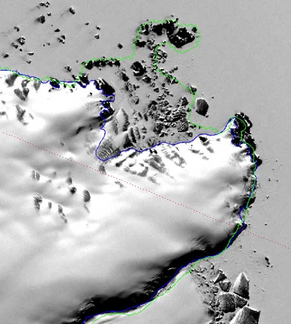
Antarctica's ice generally flows from the middle of the continent toward the edges, dipping toward the sea before lifting back up and floating. The point where ice separates from land is called the "grounding line" – essentially, the outermost edge of the ice sheet. For scientists, an accurate map of the grounding line is a first step toward a complete calculation of how much ice the continent is losing, because the most significant changes in ice mass are likely to occur at the intersection of the ocean and the ice sheets.
Previous maps of the southernmost continent lacked the details needed to properly calculate ice loss rates; sometimes islands or shadows were mistaken for the grounding line.
A team at the Goddard Space Flight Center in Greenbelt, Md., put together the new map of Antarctica's grounding line over the course of eight months, connecting 3.5 million geographic points around the continent and revealing a winding, 33,300-mile (53,600-kilometer) ice edge.
"This project has been a major achievement to come from the International Polar Year," said Robert Bindschadler, a cryosphere scientist based at Goddard who presented his team's work in June at the International Polar Year Science Conference in Oslo, Norway. "This project included young scientists, it was an international effort, and it produced freely available data — all from satellites."
Next, the scientists will use additional satellite data to determine the thickness of the ice sheet near Antarctica's edges. By combining the data sets, scientists will be able to predict with unprecedented accuracy how fast Antarctica's ice is disappearing.
This article was provided by OurAmazingPlanet, a sister site to LiveScience.

 Live Science Plus