


Infographic: A Day in the Life of the Average American
By
Live Science Staff
Published
In Infographics
(Image credit: Ross Toro, Live Science)
Follow us
Add us as a preferred source on Google
Subscribe to our newsletter
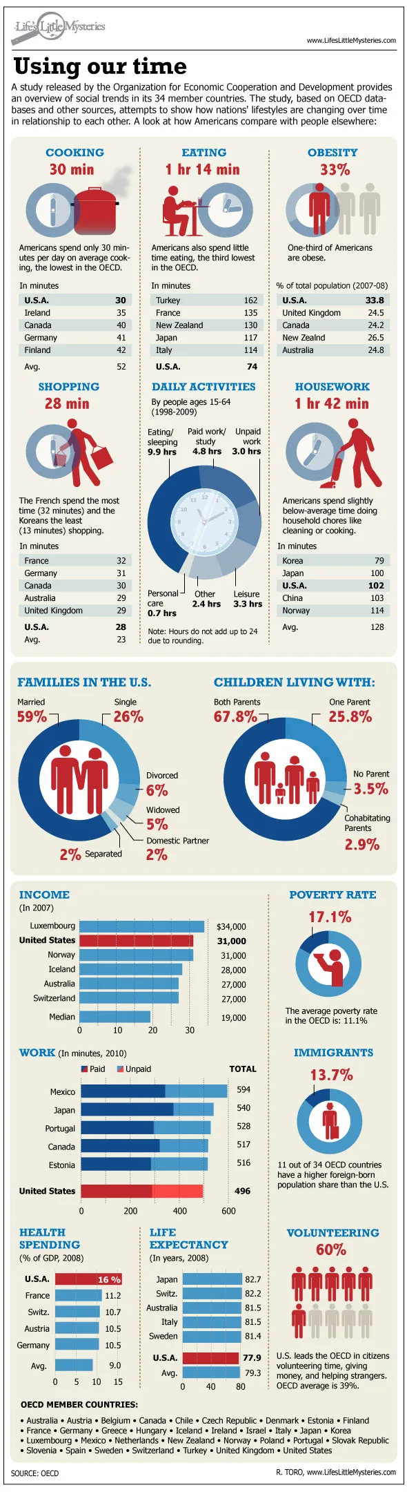
Earlier this month, the Organization for Economic Cooperation and Development released the results of a survey that revealed the social tendencies of people in 34 countries. The study revealed how Americans stack up against people in other countries by several measures, including time spent cooking and shopping, as well as the more standard statistics, such as average income and poverty rates.
You can read the full story here, but sometimes a graphic is just much more fun.
- 15 Weird Things That People Do Every Day, and Why
- 13-Pound Baby Part of a Growing Trend
- The Top 10 Best Governed Countries in the World
Sign up for the Live Science daily newsletter now
Get the world’s most fascinating discoveries delivered straight to your inbox.

For the science geek in everyone, Live Science offers a fascinating window into the natural and technological world, delivering comprehensive and compelling news and analysis on everything from dinosaur discoveries, archaeological finds and amazing animals to health, innovation and wearable technology. We aim to empower and inspire our readers with the tools needed to understand the world and appreciate its everyday awe.