Live Science Plus


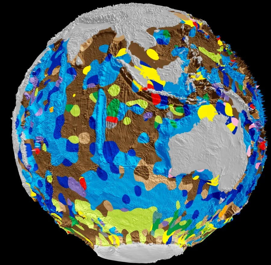
A new digital map of the composition of the seafloor reveals "microfossil" graveyards off the coast of Australia, as well as other complex deep-ocean geology.
Published Aug. 9 in the journal Geology, the interactive map is available online. It's the first digital map of global seafloor composition, and the first attempt at such a map anyone has made in 40 years. The last version of the map was hand drawn in the 1970s, according to the University of Sydney.
"The old map suggests much of the Southern Ocean around Australia is mainly covered by clay blown off the continent, whereas our map shows this area is actually a complex patchwork of microfossil remains," study author Adriana Dutkiewicz, a sedimentologist at the University of Sydney, said in a statement. "Life in the Southern Ocean is much richer than previously thought."
Article continues belowThe microfossils belong to diatoms, a type of phytoplankton that takes in carbon dioxide and expels oxygen. These organisms make about 20 percent of the oxygen in the air that humans breathe. When diatoms die, they sink to the ocean floor, carrying their carbon with them. This makes them an important "carbon sink" that keeps carbon dioxide, a greenhouse gas, out of the atmosphere, where it can warm the planet. [In Photos: The Wonders of the Deep Sea]
Surprisingly, the new map reveals that masses of dead diatoms on the seafloor in the Southern Ocean are not in the same places where diatoms bloom on the ocean surface.
"This disconnect demonstrates that we understand the carbon source, but not the sink," study researcher Dietmar Muller, a geophysicist also of the University of Sydney, said in the statement.
Understanding the distribution of dead diatoms on the seafloor is important for understanding how the oceans reacted to past climate change, Dutkiewicz said. The color-coding on the map shows what makes up most of the seafloor in a region: light green for "diatom ooze" (a mix of mud and diatom bits), blue for "calcareous ooze" (mud and calcium carbonate from microscopic shelled animals) and brown for clay. Red spots represent volcanic ash and gravel. Yellow stands for sand.
The data used to build the map come from 15,000 seafloor samples taken during research cruises. Big-data algorithms then turned these observations into a continuous map.
The map should guide future research missions, Dutkiewicz said.
"Australia's new research vessel 'Investigator' is ideally placed to further investigate the impact of environmental change on diatom productivity," she said. "We urgently need to understand how the ocean responds to climate change."
Follow Stephanie Pappas on Twitter and Google+. Follow us @livescience, Facebook & Google+. Original article on Live Science.