Why is the world map you know wrong?
Have you ever tried smashing a ball into a flat rectangle?

Get the world’s most fascinating discoveries delivered straight to your inbox.
You are now subscribed
Your newsletter sign-up was successful
Want to add more newsletters?
Join the club
Get full access to premium articles, exclusive features and a growing list of member rewards.
Walk into any school classroom and you will likely see a flat, rectangular map of the world sprawled across the wall. Generations of children have grown up learning that this projection is what Earth looks like. But does this flat map really reflect what our planet is like?
Though designed with the best of intentions — to provide a detailed and coherent projection of Earth — flat maps are far from accurate; some areas look far bigger than they really are, others appear much smaller, and distances between various land masses are misrepresented.
"Every world map is distorted in some respect," Matthew Edney, a professor of geography and the history of cartography at the University of Southern Maine, told Live Science in an email.
Related: What is the oldest-known archaeological site in the world?
"It's a question of what you want," he said. "Do you want the regions to be shaped as they are on a globe, or sized as they are on a globe? For most purposes, the latter is much more appropriate, but the aesthetic of the former is still culturally hegemonic."
Despite the protestations of flat-Earthers, our home planet is not flat — it is technically an oblate spheroid — a sphere with a flattened top and bottom and a bulge along the equator.
This has, since the dawn of mapping, presented a major problem for cartographers: How can a three-dimensional object be faultlessly represented in two dimensions?
Get the world’s most fascinating discoveries delivered straight to your inbox.
If you've got a spare globe, or an old tennis ball, try cutting it open and rearranging it into a perfect rectangle — this impractical challenge will give you a good idea of just how incompatible a spheroid and a flat rectangle are.
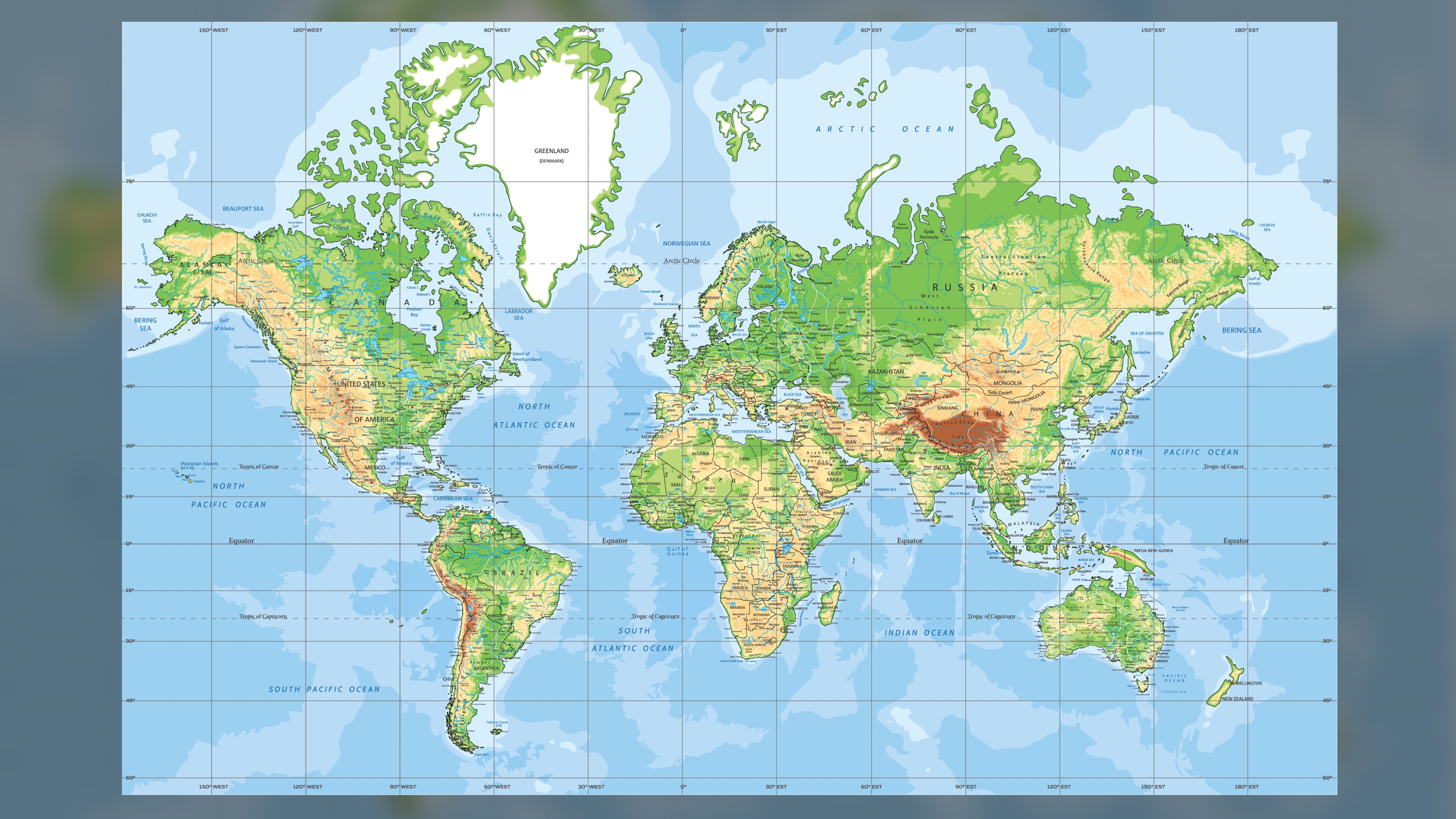
The Mercator projection, created by Flemish geographer and cartographer Gerardus Mercator in 1569, was a revelation half a millennium ago and remains the most widely used flat depiction of Earth, according to MapHover. This map was favored by navigators for centuries because it enabled them to plot courses in a straight line.
In terms of precision, however, it leaves a lot to be desired.
"Some projections distort more than others," Edney said. "Mercator's projection is the classic example. The projection is conformal and also has the special property that great circles are straight lines," Edney said.
A great circle is "defined as any circle drawn on a globe with a center that includes the center of the globe", according to ThoughtCo, an educational resource website.
"This combination of properties," continued Edney, "produces significant areal distortions. On the globe, meridians converge as they approach a pole, and the lengths of parallels of latitude grow shorter until the pole. But, when mapping the Earth into a rectangle, the poles are stretched from points into lines the length of the equator. Every parallel is stretched to the length of the equator, so on the map, there is horizontal stretching as one moves poleward.
Related: Who was the first person to write about the British Isles?
"On the globe, parallels are equally spaced, but to get the special property of great circles and straight lines, Mercator's projection exponentially increases the separation of parallels as one moves poleward. On the map, therefore, there is increasing vertical stretching as one moves poleward."
The result of this is that some regions look far bigger on the map than they are in reality, while others are drawn much smaller.
"This distortion is usually described in terms of the relative sizes of Greenland, Europe, Africa and India — the former two shown "larger" than they should be, the latter pair much smaller. Again, all is relative."
To put this in context, Greenland and Africa appear to be similar in size on the Mercator projection, when in reality Africa is nearly 14 times larger, according to Scientific American. Similarly, Alaska is represented as being around three times bigger than Mexico, when in fact Mexico is around 1.3 times bigger.
So, given the Mercator projection is flawed when it comes to its capacity to represent size, are there any other world maps that we should be using instead?
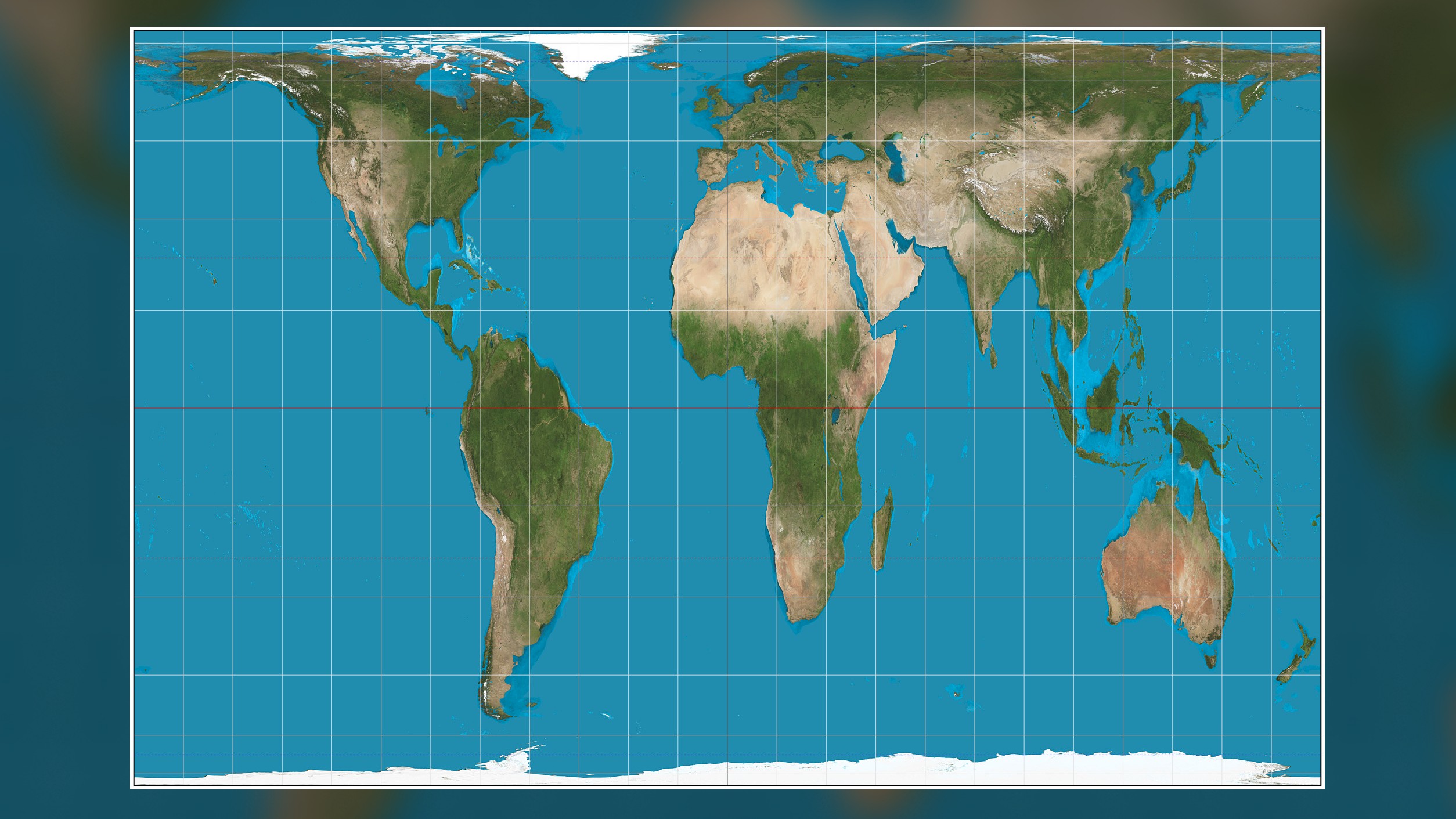
"One alternative to Mercator's projection that was popularized in the 1970s and 1980s is the Gall-Peters projection, which is equal-area, but quite ugly," Edney said. "My academic grandfather, Arthur Robinson, said it made the continents look like long underwear hung on a line to dry."
This projection has its own accuracy issues. Though all areas are the correct size relative to each other, most land masses are distorted in order to make it so. Land masses appear stretched — horizontally at the poles and vertically at the Equator — meaning that, though countries are roughly the correct size, they are by no means the right shape. This distortion is, as with the Mercator projection, most prominent at the poles.
Various other flat maps have been drawn over the centuries, but they all have the same issue: It is impossible to portray the 3D Earth on a 2D map without compromise. The Winkel Tripel projection, designed in 1921, is the National Geographic Society's preferred flat map, but even this has issues with distortion, particularly regarding the Pacific Ocean, which looks vaster on this map than it is in reality.
This map is favored by National Geographic because, when compared to other small-scale maps, there is less distortion. It is known as a "compromise projection" because, while it doesn't entirely eliminate the common flat map distortions regarding area, direction or distance, it minimizes them as much as possible. This ultimately means that almost every part of the map is distorted in some way, just not excessively.
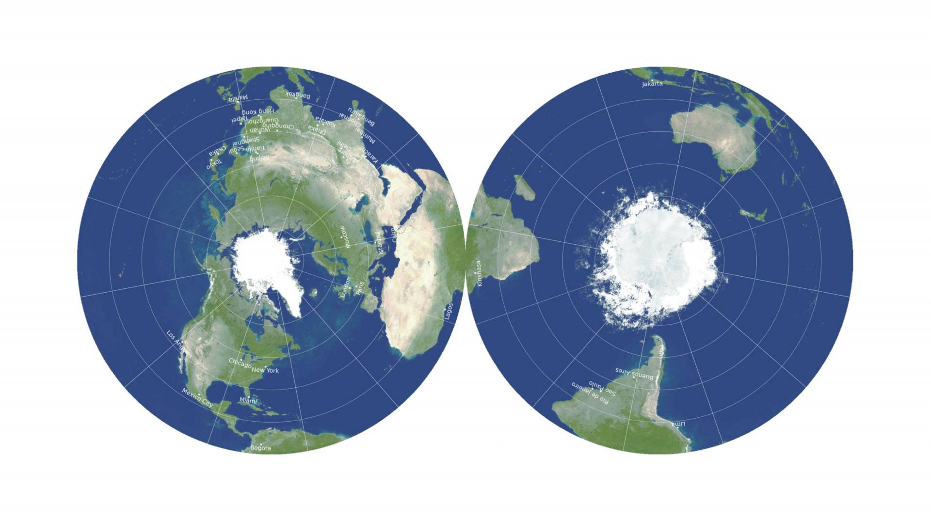
In 2021, astrophysicists produced what is believed to be the most accurate flat map of Earth ever, as reported by Live Science. It consists of two "pancake maps" that can be viewed side by side or back to back. This way of presenting Earth is fundamentally different to nearly every other flat map, and it remains to be seen if it will be widely adopted for use in textbooks and on classroom walls.
"I would like it if all map publishers went to equal-area projections," Edney said. "But ultimately it's a matter of what sells."
Originally published on Live Science.

Joe Phelan is a journalist based in London. His work has appeared in VICE, National Geographic, World Soccer and The Blizzard, and has been a guest on Times Radio. He is drawn to the weird, wonderful and under examined, as well as anything related to life in the Arctic Circle. He holds a bachelor's degree in journalism from the University of Chester.
 Live Science Plus


