


Beer on Twitter: Finding Drinking Patterns in Tweet Data (Infographic)
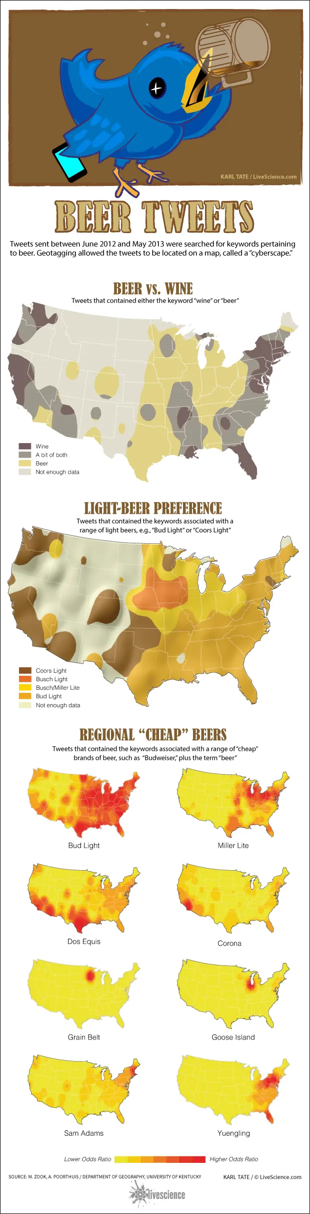
Researchers create maps of beer preferences by geotagging tweets.
(Image credit: By Karl Tate, Infographics Artist)


Go beyond the headlines
Unlimited access to our exclusive features, expert analysis and in-depth interviews, all ad-free


Keep exploring and earning more as a member.

Explore your membership benefits.
Science Newsletters
Select the newsletters you'd like to receive and enter your email below.
Please login or signup to comment
Please wait...