New interactive map of the universe is a rainbow-colored slice of cosmic pie
Astronomers have created a colorful interactive map of more than 200,000 galaxies and quasars spanning the lifespan of the cosmos.
Get the world’s most fascinating discoveries delivered straight to your inbox.
You are now subscribed
Your newsletter sign-up was successful
Want to add more newsletters?
Join the club
Get full access to premium articles, exclusive features and a growing list of member rewards.
Astronomers have created a new map of the universe that looks remarkably like a rainbow-colored slice of cosmic pie.
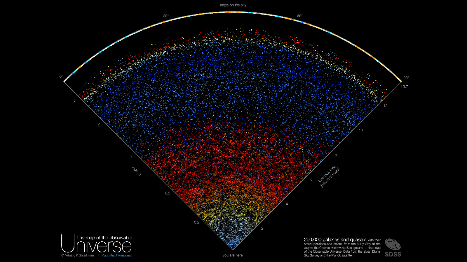
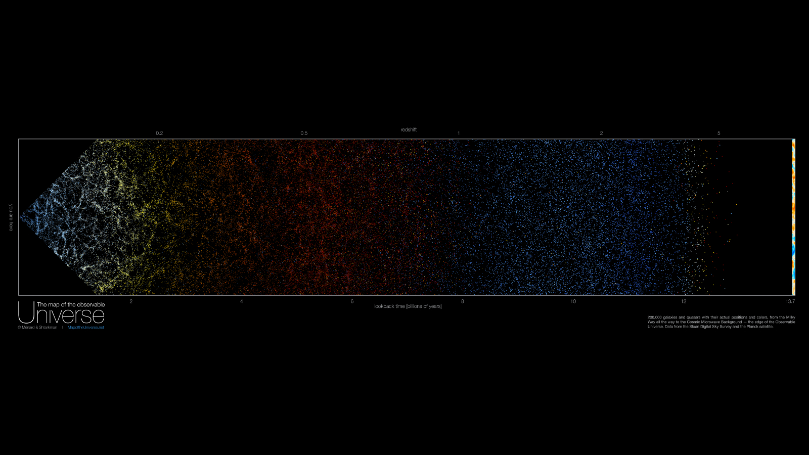
The interactive image, which has been named The Map of the Observable Universe, was released online Nov. 17 and is made of real-color specks of light emitted by more than 200,000 galaxies and quasars — including the Milky Way, which sits at the tip of the slice. However, in reality, the wedge-shaped map only offers a small serving of the observable universe, measuring 90 degrees across and 10 degrees deep from our viewpoint of the sky from Earth.
Astronomers constructed the map using 15 years worth of data collected by the Sloan Digital Sky Survey, which collects images of distant galaxies taken by a single telescope in New Mexico. Normally, this type of data is only accessible to scientists, but the project researchers have designed the map to be easily accessible to anyone.
"Astrophysicists around the world have been analyzing this data for years, leading to thousands of scientific papers and discoveries," lead map designer Brice Ménard, an astronomer at Johns Hopkins University in Baltimore, said in a statement. "But nobody took the time to create a map that is beautiful, scientifically accurate and accessible to people who are not scientists."
Related: See the deepest image ever taken of our universe, captured by James Webb Telescope
As well as showing the enormous scale of the cosmos, the map also provides a glimpse back in time to the very beginning of the observable universe.
Each galaxy or quasar in the map is represented by a single point that is colored with the average wavelength of light that it emits. As the universe expands, the wavelengths from distant galaxies stretch and become more red in color. This redshift causes the gradual change from blue to yellow, to orange and finally to red over the first 8 billion years of the image. After this point, galaxies become much harder to spot and only quasars — extremely bright objects powered by the supermassive black holes at the center of galaxies — are visible.
Get the world’s most fascinating discoveries delivered straight to your inbox.
Quasars are much brighter than galaxies and give off much shorter wavelengths of light, which means that, even when redshifted, they shine with a blue hue. However, at around 12 billion years into the image several red and orange dots appear, which shows that even quasars succumb to this cosmic color change.
Past the most distant quasar and at the crust of the pie slice the map features a bright yellow and blue band. This depicts the cosmic microwave background — radiation from the Big Bang that is so old that it has been stretched into radio waves by the time it arrived at Earth — as photographed by the European Space Agency's Planck space observatory in 2013.
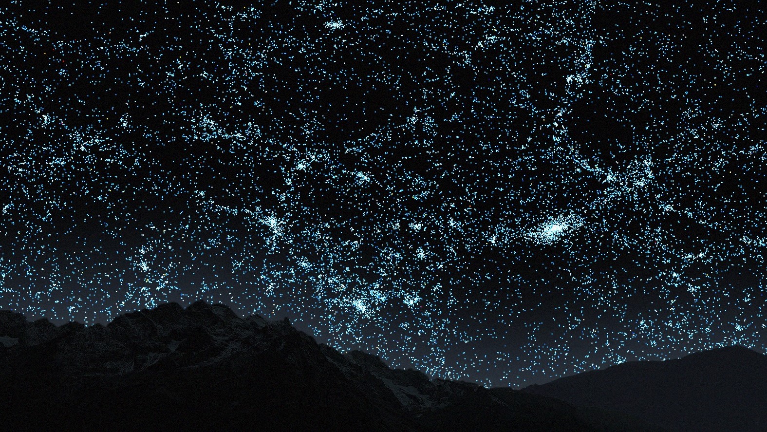
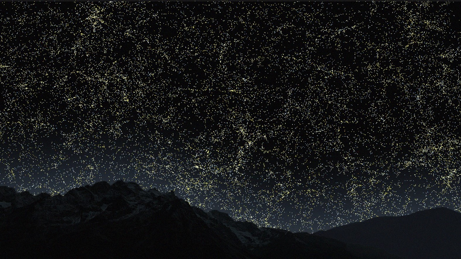
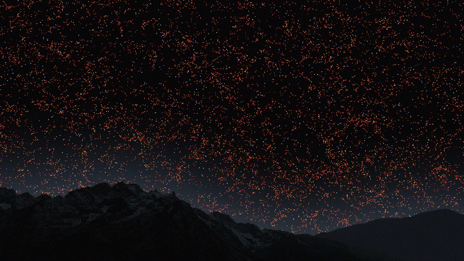
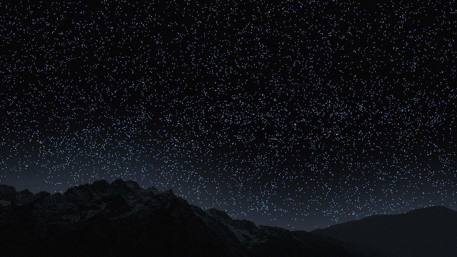
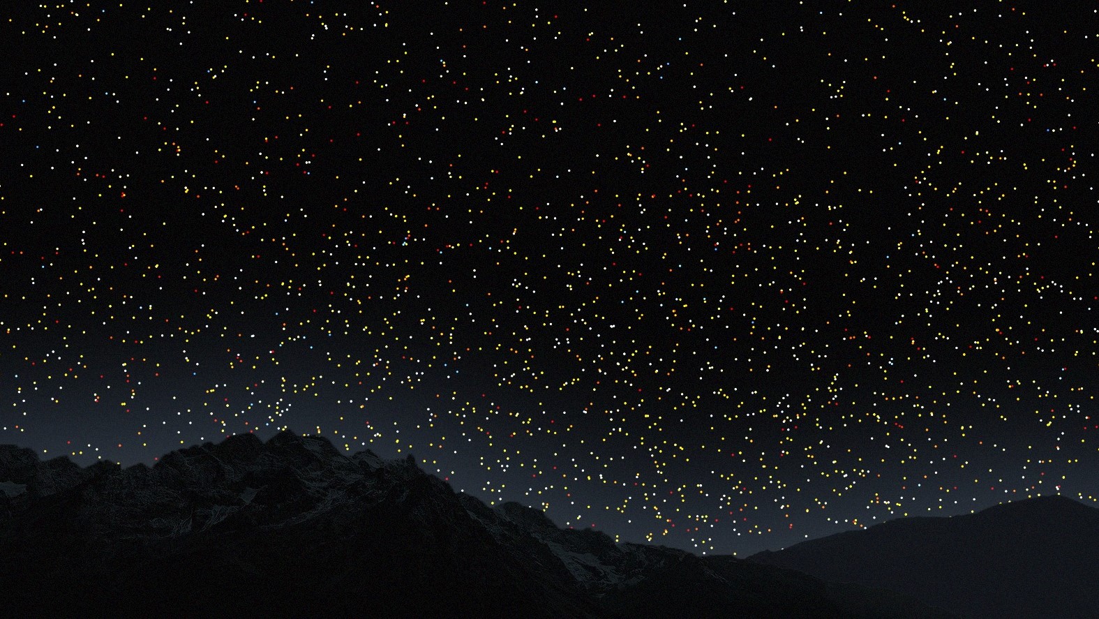
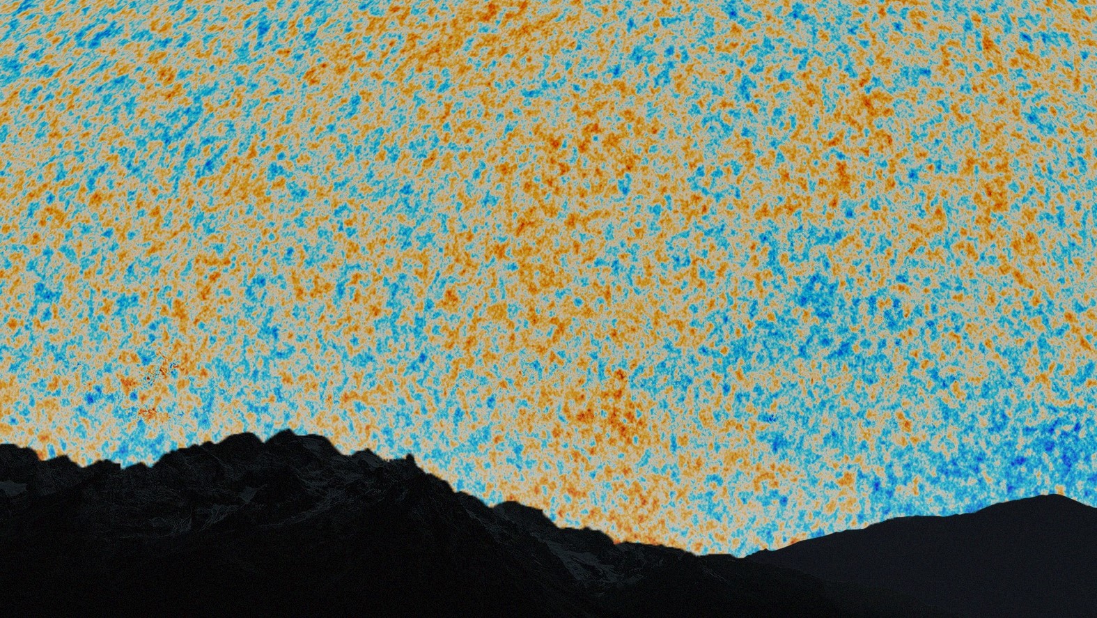
New state-of-the-art telescopes, such as the James Webb Space Telescope, are providing people with thousands of awe-inspiring images of the cosmos. But one of the main limitations of these images is that they can't properly illustrate the true scale and structure of the observable universe. The researchers who designed the new map suggest that their visualization helps to fill in this important knowledge gap for non-academic astronomy enthusiasts.
"We are used to seeing astronomical pictures showing one galaxy here, one galaxy there or perhaps a group of galaxies," Ménard said. "But what this map shows is a very, very different scale."
The team also hopes that their map can help provide people with a bit of cosmic perspective.
"In this map, we are just a speck at the very bottom, just one pixel," Ménard said. "And when I say we, I mean our galaxy, the Milky Way which has billions of stars and planets."

Harry is a U.K.-based senior staff writer at Live Science. He studied marine biology at the University of Exeter before training to become a journalist. He covers a wide range of topics including space exploration, planetary science, space weather, climate change, animal behavior and paleontology. His recent work on the solar maximum won "best space submission" at the 2024 Aerospace Media Awards and was shortlisted in the "top scoop" category at the NCTJ Awards for Excellence in 2023. He also writes Live Science's weekly Earth from space series.
 Live Science Plus


