
 Live Science Plus


Clickable Internet Map Shows 350,000 Websites

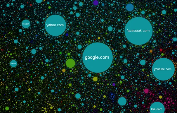
In the map of a place, addresses that are physically close to each other in life get placed physically near each other in the map. But in a map of the internet, how would you define closeness? Russian programmer Ruslan Enikeev decided to use the same measure that Google uses for relevancy, and which bloggers have called the currency of the internet — or even the soul of the internet. In Enikeev's Internet Map, the more often visitors go from one site to another, the closer they appear. He mapped more than 350,000 websites from 196 countries that way.
The result feels pretty intuitively accurate. As Enikeev wrote in the "About" section of the map, the sites tended to cluster by the type of content they have. Major media sites, such as the New York Times, Wall Street Journal, and the Huffington Post, show up together. Buzzfeed pointed out that viewers can find a "'screwing around on the internet' section," which includes Reddit, Tumblr and Buzzfeed itself. Of course, there's also a "pornostrana comparable in size with all of Euronet," as Enikeev wrote on a Russian coders' site, where he explains in technical detail how he made the map.
Enikeev coded other important internet measures into his map. The more traffic a website gets, the bigger its circle on the map. And there's a hint of the non-digital world in the map, as each site's circle is color-coded by its country of origin. The red sites are all Russian, for example, while the light blue ones are from the U.S.

As people might expect, there are clear country clusters, but most of them are dotted through with other countries' sites. The exceptions are China, which is almost solidly yellow, and more surprisingly, Japan, which shows up as purple bubbles at the bottom right corner of the map.
Enikeev created the map because he thinks the internet "surpasses anything mankind has ever created" in complexity, he wrote on the map's site. "The Internet map is an attempt to look into the hidden structure of the network, fathom its colossal scale, and examine that which is impossible to understand from the bare figures of statistics," he wrote.
Sources: Internet Map, Habrahabr (We used Google's translation Russian-to-English translation here), Buzzfeed
This story was provided by InnovationNewsDaily, a sister site to LiveScience. Follow InnovationNewsDaily on Twitter @News_Innovation, or on Facebook.
