How a Map of Your Brain Can Trick Your Brain
Color maps in scientific papers are too colorful, according to data scientists. These figures, they say, can be so vivid that they trick people's brains into thinking scientific results are more dramatic then they really are.
The colorful figures, illustrations meant to visually communicate data, might be the most compelling thing to look at in a paper full of dense text and tables of date. These images — maps of blood flow in the brain, humidity levels in Great Britain or an ant's favorite place to munch leaves — just pop out.
That's a problem.
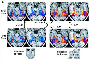
Here's one example of a color map of the human brain provided by Chris Holdgraf, a data scientist at the University of California, Berkeley:
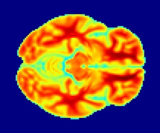
Images like this are attractive, Holdgraf told Live Science. But they're also a problem, because they can trick your brain. [3D Images: Exploring the Human Brain]
The idea behind a color map is simple. Sometimes, you have multiple kinds of data that you're trying to represent in a single figure. When you have just two kinds of data, that problem is easy to solve. Just create an x-axis and a y-axis, like so:
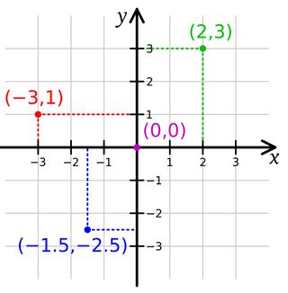
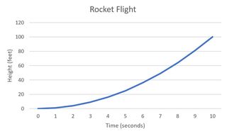
If you plot one of the two kinds of data (let's call it "time") along the x-axis and the other kind of data (let's call it "height of rocket") along the y-axis, you can just put a lot of points on the graph to easily, clearly represent the information. As the rocket climbs over time, the points move higher up the graph.
Sign up for the Live Science daily newsletter now
Get the world’s most fascinating discoveries delivered straight to your inbox.
But sometimes, you have three kinds of information to convey in a graph. A brain scan, for example, might give you a map of a slice of the brain — that's both your x-axis for horizontal position and y-axis for vertical position — with information about how much blood is flowing through each point in that slice. There's no room for a 3D z-axis on a flat piece of paper, so researchers typically use color to represent that third type of data. Red might mean "lots of blood flow," and blue might mean "less blood flow." It's a fairly easy kind of visualization to make using standard scientific software.
The problem, Holdgraf said, is that human brains don't perceive color as effectively as they perceive positions in space. In a 2015 talk, UC Berkeley data scientists Nathaniel Smith and Stéfan van der Walt explained the problem in detail: If two dots are an inch apart, our brains are usually pretty good at accurately perceiving the distance between the two, no matter where they are in a visualization. So, figures like that climbing rocket graph are pretty easy to read. But color is more complicated. In a rainbow, a shade of orange might be as far from red as it is from yellow, but our brains might perceive the hue as much redder or much more yellow than it really is.
"Your brain perceives color in nonlinear — kind of wacky — ways," Holdgraf said. "If you're not careful about the color you choose, then a step from 0 to 0.5 might be perceived as actually to 0.3. And then that second step from 0.5 to 1 might actually be perceived as like 0.8."
That's a problem, Holdgraf said, when you're using color to represent relationships among precisely collected scientific data points. A visualization might make a discovery look more dramatic than it really is or make small effects look very large.
"I don't think this is something anyone has done with any kind of bad intent," he said.
For the most part, he said, people are just using default color sets that come along with scientific software.
But Holdgraf, along with Smith and van der Walt, said that scientists need to shift to color palettes carefully selected to avoid tripping any "perceptual deltas" in the human brain — places where visual science says our color perception is uneven. Such color palettes, he said, are less dramatic-looking. They don't "pop." But for most people, they'll convey a more accurate picture of what data really says.
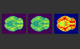
To illustrate the point, Holdgraf wrote a short bit of software called "makeitpop" that can reveal how much perceptual deltas distort data visualizations. In the tweet above, the image on the left turns data into color using "viridus," a color pallette that avoids perceptual deltas. The one in the middle is made using Jet, a common color pallette that, due to perceptual deltas, can make data look more dramatic than they really are. The image on the right is the result of using makeitpop on the viridus image, highlighting areas that would get warped using Jet.
He said he hopes the example will help get the word out to scientists about perceptual deltas and how to avoid them. However, he added that it will never be possible to do this perfectly, because not everyone perceives color in exactly the same way.
Holdgraf also said that while he does think this sort of distorted color map is a serious problem, he doesn't think it's leading scientists to false conclusions — because no one bases their interpretation of a paper purely on a color map.
"It's the icing on the cake [of a paper]," he said.
Still, he said, it's an issue of trying to be as honest and straightforward as possible in scientific research. If scientists want to be as precise and accurate as possible, he said, they shouldn't be using visualizations that can distort reality.
Originally published on Live Science.

